
The Weight of Choice
When too many options make users freeze — and how thoughtful design can bring them back to flow.
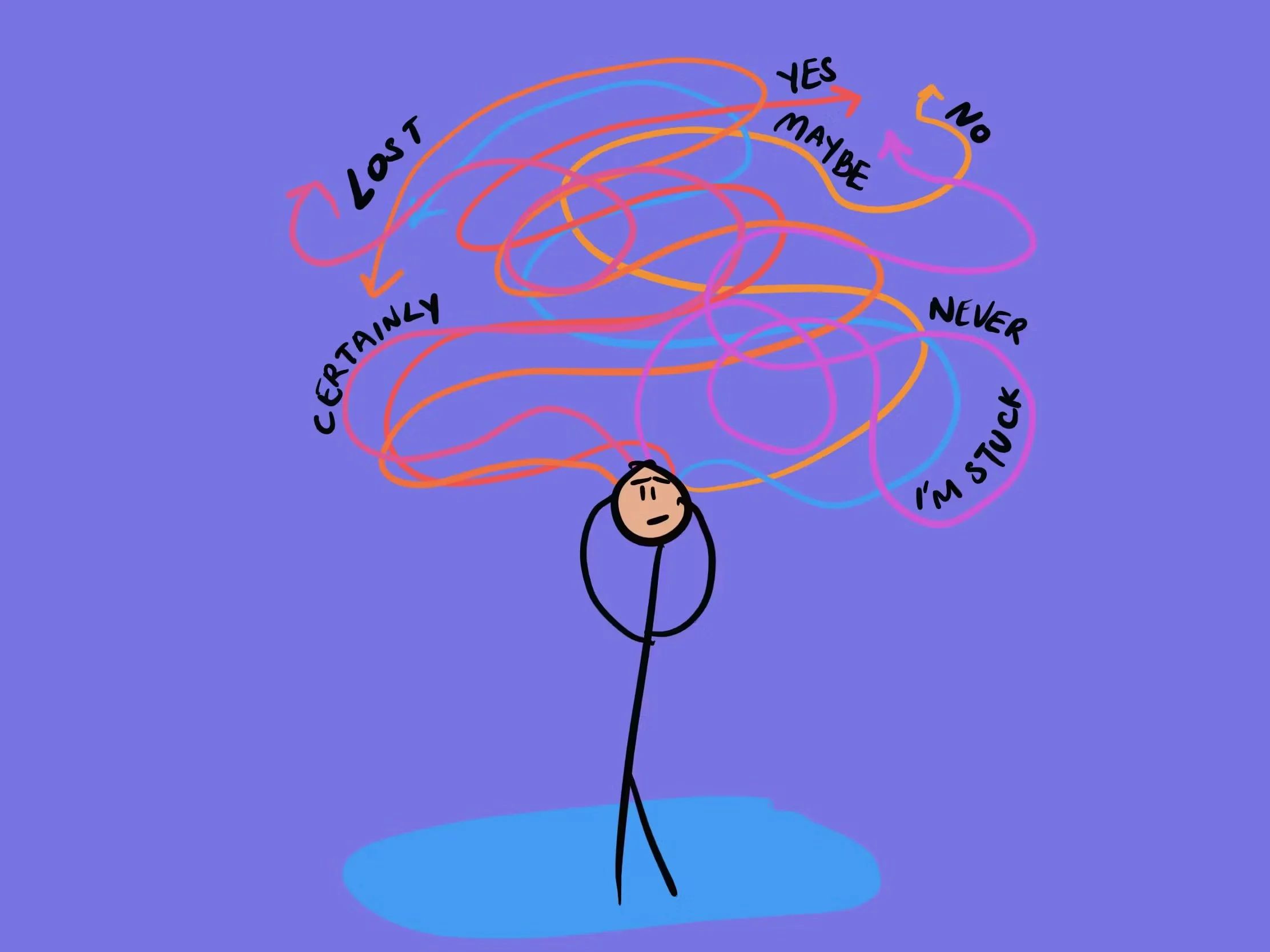
The Choice Trap We All Fall Into
Picture this: You open Netflix, ready to relax. Thirty minutes later, you’re still scrolling, feeling more stressed than when you started. Why does picking a movie feel so hard?
It’s not just bad UX—it’s a clash between how our ancient brains handle choice and how modern interfaces present them. The challenge isn’t only the number of options, but how significant each choice feels.
Why Time Changes the Weight of a Decision
Here's what most designers miss: The time commitment attached to a decision changes everything.
On Netflix, picking a movie often means investing two hours—so there’s a real fear of choosing “wrong.” This increases indecision because the perceived cost of making a bad choice is high.
Contrast that with Spotify: If you pick a song you don’t like, you can skip it instantly and try another—no big deal. The consequence is small, the risk is low, and choices feel lightweight and playful. Spotify’s design lets users explore, knowing they can easily undo choices.
What Your Brain Actually Does When It Chooses
When making a decision—big or small—your brain lights up the same areas as when you experience pain. Decision fatigue isn’t just being tired; it’s your brain burning resources to weigh outcomes. And when the stakes seem higher (like a long movie), anxiety ramps up even more.
Meanwhile, ancient philosophy tells us that getting attached to outcomes breeds stress. So, the solution isn’t to eliminate choice, but to make each choice feel less loaded.
How Algorithms Help (and Sometimes Hurt)
Both Netflix and Spotify use clever algorithms to help users decide. Netflix suggests shows and movies based on your past viewing, and even asks for feedback at the end so it can get better at matching your taste. This reduces some friction, but can’t completely erase the stress of investing time in a long movie.
On the other hand, Spotify’s continual music suggestions and quick-skip feature mean users face almost zero penalty for picking badly. By making choices feel reversible and lightweight, Spotify encourages playful exploration.
The Three Types of Choice Paralysis (That UX Gets Wrong)
1. Analysis Paralysis : Trying to consider every detail, especially when the stakes feel high.
Netflix: Complicated comparison of dozens of titles.
Spotify: Quickly sampling playlists, skipping what you don’t like.
2. FOMO Paralysis : Fear of missing out, made worse when you can’t undo a choice.
Netflix: Spending ages searching for the “perfect” movie because time invested is big.
Spotify: No worries—just skip or replay anything you want.
3. Identity Paralysis : Feeling like every choice defines you, especially with onboarding or profile setups.
The Paradox Solution: Reduce Choice Weight, Not Choice Count
Instead of only offering fewer choices, design ways to make choosing feel less consequential. Allow easy reversibility. Let systems learn and adapt to users. Focus on the journey, not “getting it right.”
Spotify shows how choices can be playful and low-pressure—even with plenty of options. For high-stakes platforms like Netflix, supporting feedback, personalization, and reversible decisions can reduce anxiety linked to time investment.
Practical Design Principles
Default to defaults: The app should work before a user changes anything.
Make revising choices easy: The lower the risk, the faster the decision.
Maintain momentum: Keep users in flow—don’t interrupt with tough decisions.
Smart context defaults: Use time, location, and behavior to suggest relevant options.
Are We Designing Choice or Anxiety?
Every interaction teaches users something about trust. When choices feel low-risk and reversible, users explore more, learn faster, and stay longer.
In the end, great design isn’t about removing choice — it’s about removing fear from choice.
“When I design, I focus less on how many options exist, and more on how each one feels to the user.
Can they change their mind? Does the system learn with them? Does every decision move them forward instead of making them hesitate?”
So the next time you design a flow, ask yourself:
Are you designing choice — or anxiety?
Key Takeaways for Designers
✅ Quantity matters less than the weight of each choice.
✅ Design for “satisficing”—good enough, not perfect.
✅ Make decisions reversible or easy to change.
✅ Let the system infer preferences, rather than forcing self-declaration.
✅ Keep users moving, not stalled by big decisions.
The goal: Confident users, not overwhelmed ones.
How have you observed choice overload affecting your users? What patterns in choice architecture seem to reduce or increase this effect in your designs?