
2025
HPE: From Menu-Driven to Intelligent Conversations
HPE's support chatbot had a 78% escalation rate. Users would open it, hit a menu, get frustrated, and call a human. I redesigned it from the ground up — reducing escalations to 46% in the first month by doing something counterintuitive: making the AI more honest instead of making it smarter.
Role: Senior Product Designer
Duration: 3 weeks within an active product cycle
Scope: End-to-end conversational experience design (desktop, tablet, mobile)
Collaboration: Lead UX Designer, Product Manager, Engineers
The Problem
A network admin needs to know which devices have expired contracts in the APJ region. They open the chatbot and get this:
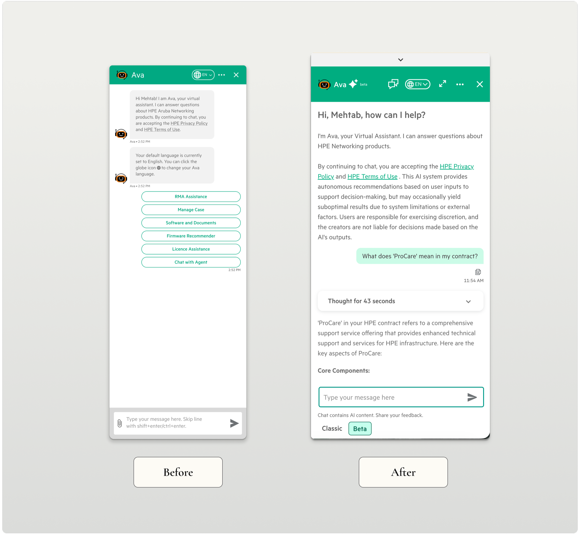
Click "Asset Management" → Click "Contracts" → Click "View All Documentation" → Here are 15 articles and videos → (gives up and calls an agent)
What should take 10 seconds took 10+ minutes. Most users didn't get that far.
"I don't even click the chatbot icon anymore. It's faster to just call support."
The chatbot wasn't failing because the AI was bad. It was failing because it was designed like a menu system pretending to be a conversation — rigid navigation, link dumps instead of answers, and no acknowledgment of its own limitations.
The Users
Customer Success Managers, Network Administrators, Root Account Managers — technical professionals troubleshooting live issues when they reach for the chatbot. When a network is down, seconds matter. These users ask questions the way they'd ask a colleague. When they can't get a direct answer, they don't wait — they call someone.
That reality forced the design to be different.
The Design Challenge
The hardest part wasn't making the chatbot conversational. It was making it trustworthy.
We had 3 weeks and AI that wasn't perfect. The temptation — and the stakeholder pressure — was to hide that. Make it look smarter than it was. I disagreed. Users who sense a system is concealing its limitations don't trust it — they abandon it.
The insight that changed everything: users don't need perfect AI. They need to feel in control. That shifted our entire frame — from "make AI smarter" to "make AI honest."
The Risky Decision: Give Users an Escape Route
The product team wanted to sunset the old chatbot and force everyone onto the new AI version.
I pushed back. Users who don't trust AI won't suddenly trust it because we removed their alternative. They'll just stop using the chatbot entirely.
My proposal: keep both. Design a seamless toggle between AI mode and Classic mode — switch anytime, no conversation lost.
This felt risky to stakeholders. Why give users an escape route? What we found was the opposite of what everyone feared — the escape route was what made people willing to try. The safety net enabled the risk-taking. When they feel trapped, they resist.
Every mode switch included optional feedback, giving us real data on when and why users lost trust.
Thoughtful mode transitions with optional feedback and transcript download—respecting user choice while gathering insights
The Solution: Show the AI's Work
Three decisions defined the redesign:
Natural conversation over menus. We removed menus entirely. Users type questions like they'd ask a colleague. Testing surfaced something unexpected: users preferred occasionally rephrasing over clicking through five menu levels. Rephrase is effort they choose. Navigation is effort imposed on them.
Natural conversation replaces rigid menus—personalized greeting, context awareness, and intelligent suggestions
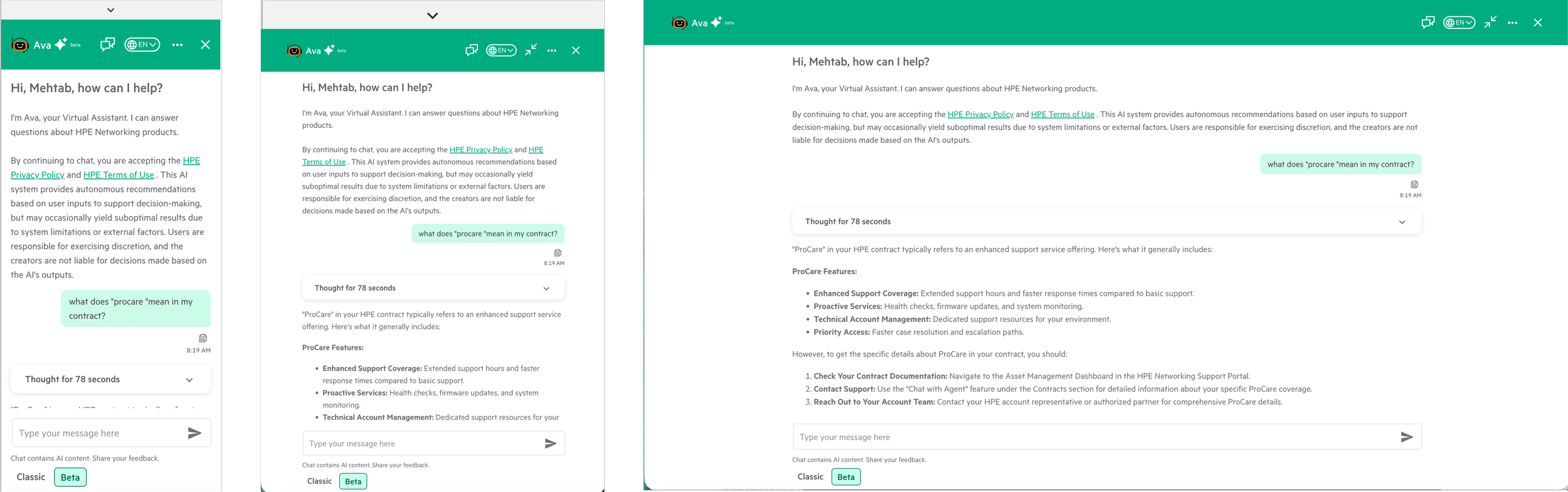
Cite sources, don't hide uncertainty. The old system linked to 50-page PDFs. The new experience reads the documentation and answers directly — with a source citation users can verify. That citation was one of the most important design decisions in the project. Transparency increased trust, it didn't decrease it. We also discovered users trusted answers more when they saw a processing indicator than when responses appeared instantly. Instant felt suspicious. "Too good to be true" was how one tester put it.
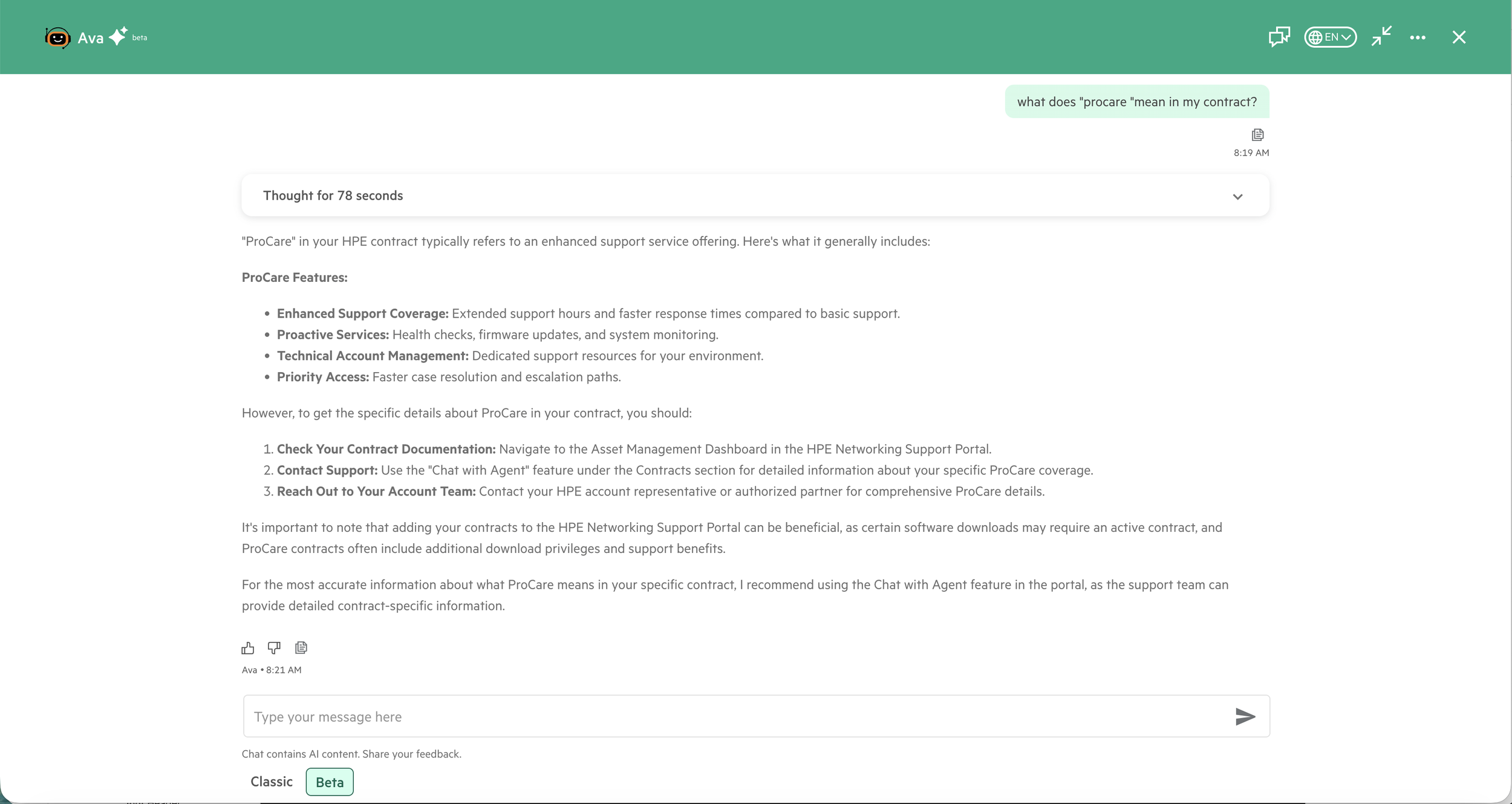
AI reads and explains documentation in seconds—no more hunting through 50-page PDFs for answers
Live answers, not live links. Same question, two approaches — Old: click through menus, get documentation links, find the answer yourself. New: ask naturally, get "You have 3 devices with expired contracts in APJ. Would you like to renew them?" The shift wasn't technical. It was a choice about what the chatbot was actually for.
Trust Through Transparency
Every interaction reinforced: You're in control. We'll show our work. You can verify everything.
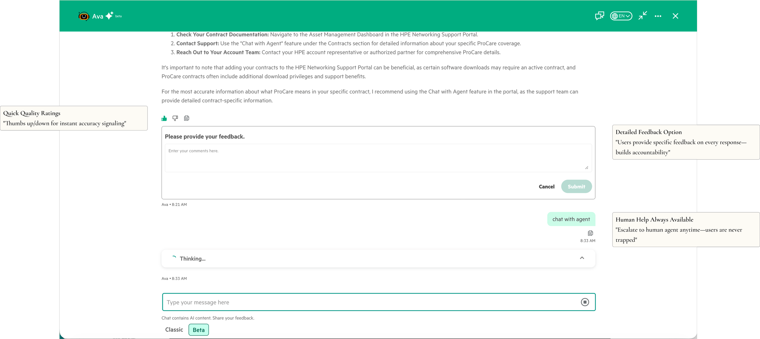
Trust through transparency—optional detailed feedback, quick ratings, and always-available human support
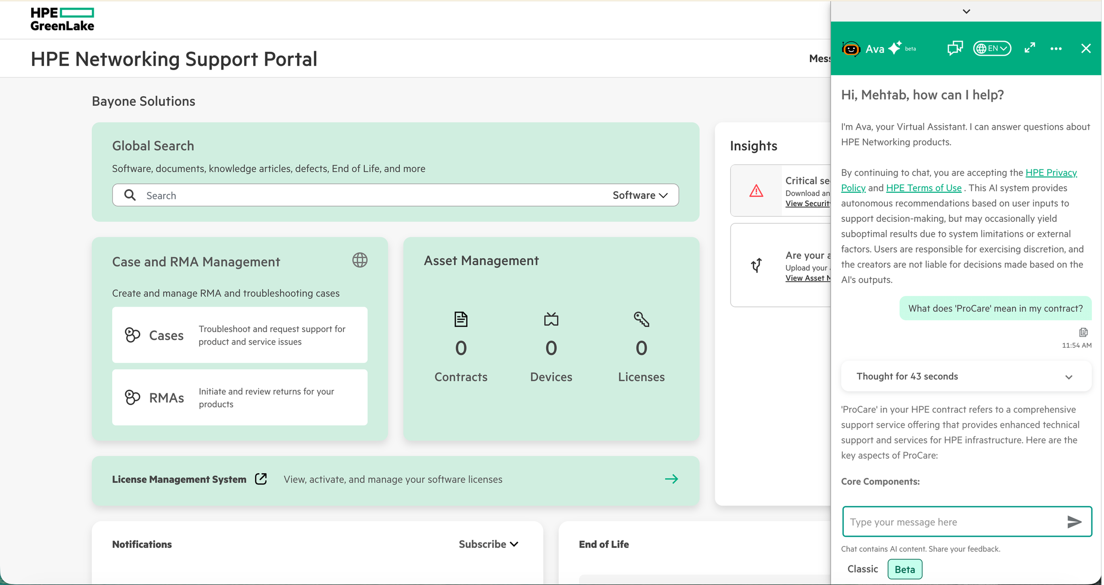
Make It Work on Mobile
Mobile and tablet adoption was nearly zero—users avoided the chatbot on smaller screens.
Network admins troubleshoot on-site from mobile while CSMs work from desktop—same experience optimized for each device
Validation & Iteration
50 common queries across all three user types. 78% correct on first attempt, 94% after clarification — within acceptable range for the rollout. Prototyping with Claude and Cursor let us test conversational patterns in hours instead of days, which was the only reason the 3-week timeline was possible.
Impact
32% reduction in escalations — 78% to 46% in the first month
3x increase in chatbot usage among users who had previously bypassed it
Resolution time down from 8+ minutes to under 2 minutes
~$150K projected annual savings from reduced agent workload
Reflections
I came into this project thinking the challenge was conversational flow. The real challenge was trust.
What I'd do differently: establish baseline metrics before launch, not after. We reconstructed pre-launch data from support logs and it was messy. And I'd design uncertainty as a first-class pattern from day one — "I'm not sure, but here's what I found" should have been core, not an afterthought.
The biggest lesson: AI doesn't need to be perfect to be useful—it needs to be honest.