
2025
HPE: Building Account Visibility from Zero for Enterprise CSM Teams
A CSM once told me she kept 7 browser tabs open just to answer one customer question. I designed a tool that eliminated those tabs — reducing navigation by 75% by doing something that felt wrong at first: giving power users more information, not less.
Role: Senior Product Designer
Duration: 3 weeks within an active product cycle
Scope: End-to-end UX: problem framing → strategy → interaction design → handoff
Tools: Figma, FigJam
The Problem
Enterprise customers often have 10–20+ premium accounts across multiple regions. Customer Success Managers had no way to see them together.
A CSM managing a customer with 15 accounts across 3 regions had to open 15+ different screens just to get a complete picture. Then do it again the next day. The system had no unified layer — CSMs navigated individual account pages with no way to group or view related accounts together. They tracked relationships in spreadsheets outside the system entirely.
As one CSM put it: "I don't need it to be pretty. I need to stop clicking 50 times a day."
Result: hours lost every week to navigation, context switching, and manually reconstructing information the system already had.
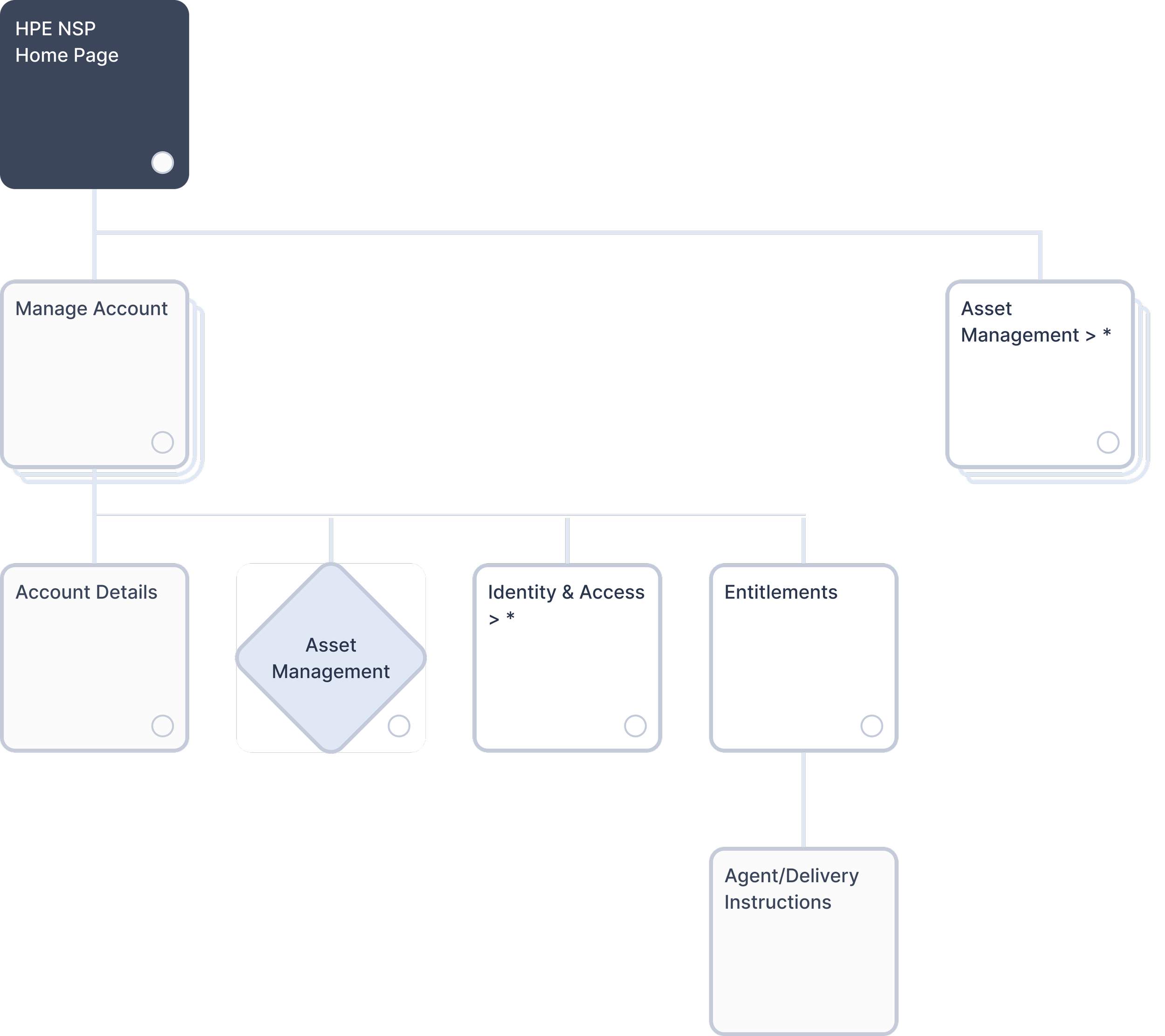
Original system architecture. CSMs navigated individual Account Details with no unified account management layer.
The Users
Customer Success Managers and NSP Superusers — highly technical professionals managing enterprise relationships worth millions, handling 5–20+ premium accounts per customer.
The insight that changed my approach: these users don't need simplified interfaces. What looks "clean and minimal" is actually slower for them. They want everything visible so they can move fast. That meant the standard UX playbook — progressive disclosure, cards, simplified views — was exactly wrong for this context.
The Design Challenge
Most UX patterns push for interfaces that reveal information gradually. But CSMs needed to see account hierarchies, relationships, statuses, and metadata all at once to make informed decisions quickly. Simplifying the interface wouldn't help them — it would just add clicks between them and the information they already knew they needed.
The question that drove every design decision: how dense is too dense?
Three Versions, One Answer
I explored three directions to find the balance.
Version 1 — Too simple. Clean card-based layout following standard dashboard patterns. CSMs still had to click into each card to see basic information. Quick checks became multi-step workflows. I'd moved the problem around without solving it.
Version 2 — Too dense. Everything visible at once. Maximum information density. The first time I showed it to the team, I got concerned looks. Even technical users found it overwhelming and hard to scan.
Version 3 — Balanced. Comprehensive but organized. All the information CSMs need upfront, with enough visual hierarchy to scan it quickly.
The conclusion wasn't obvious before I did the work: the right density isn't about following conventions. It's about matching the interface to how users actually work.
What I Built
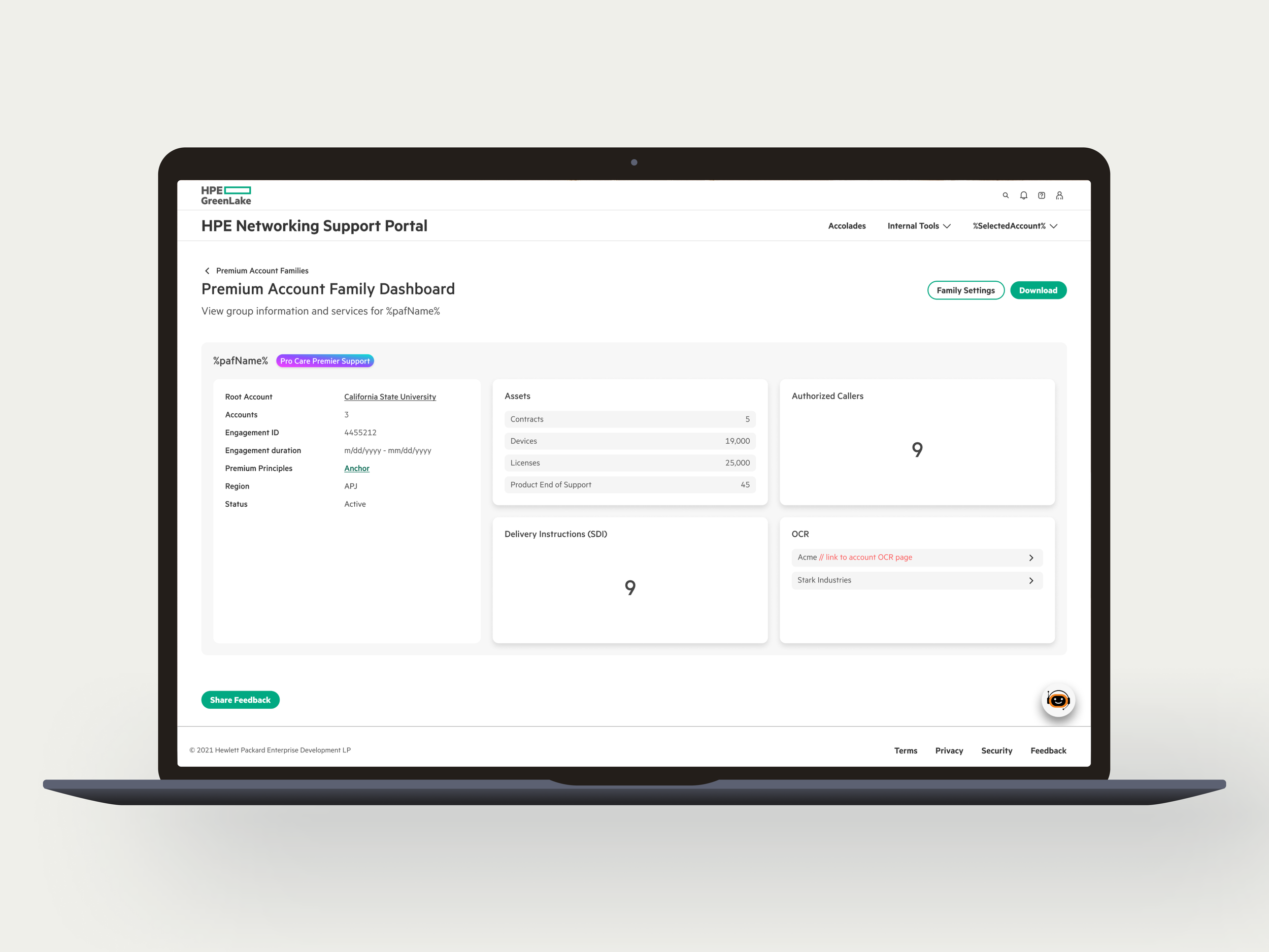
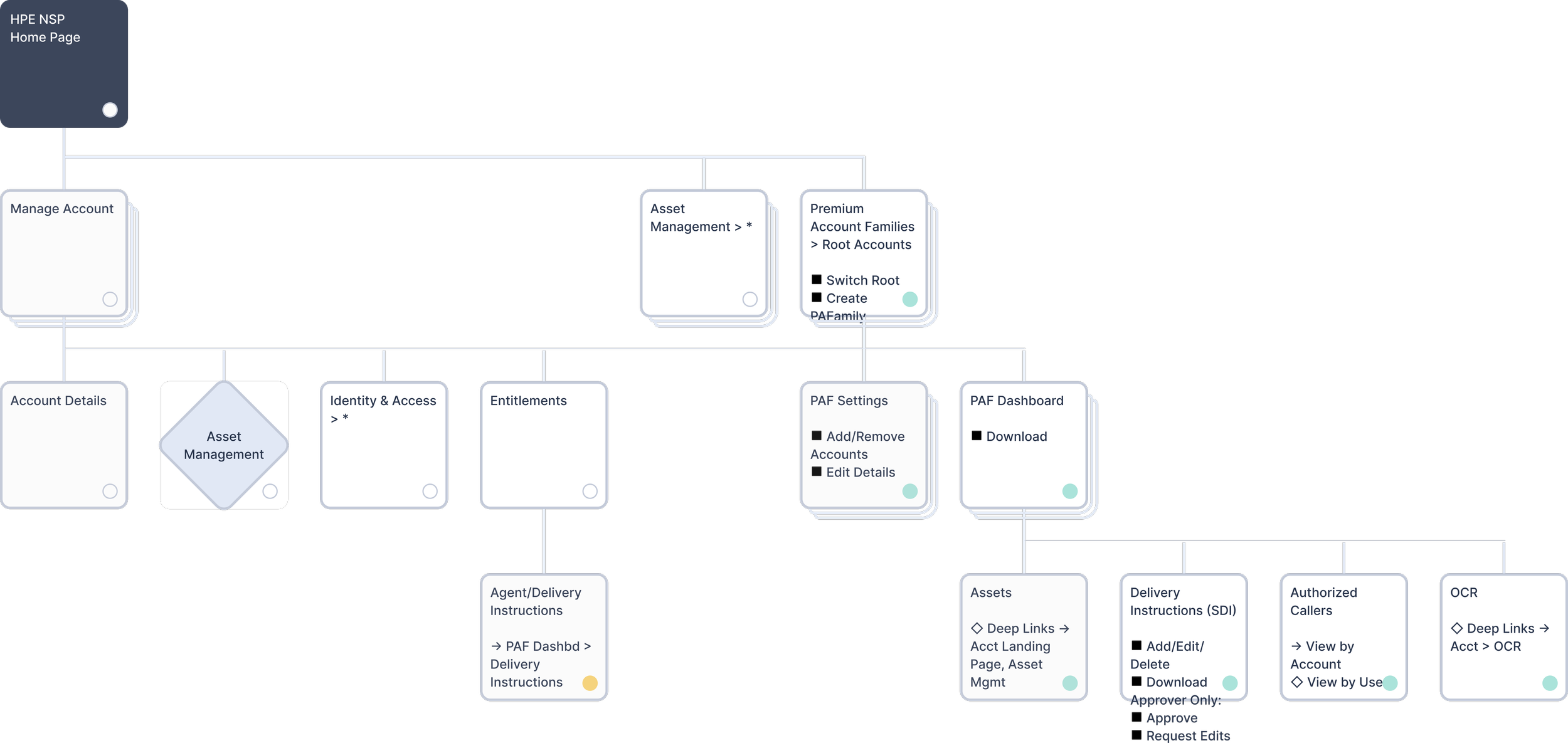
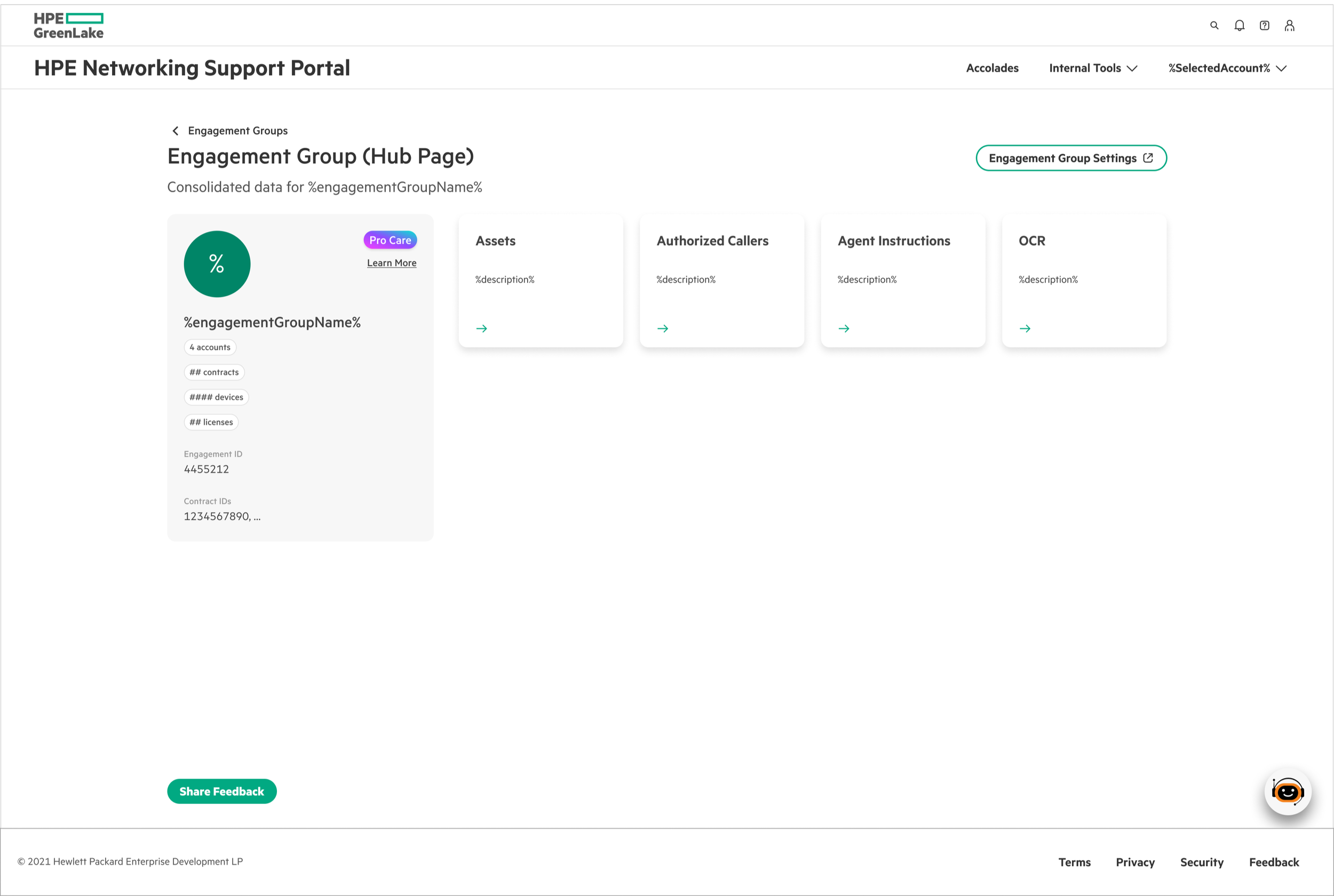
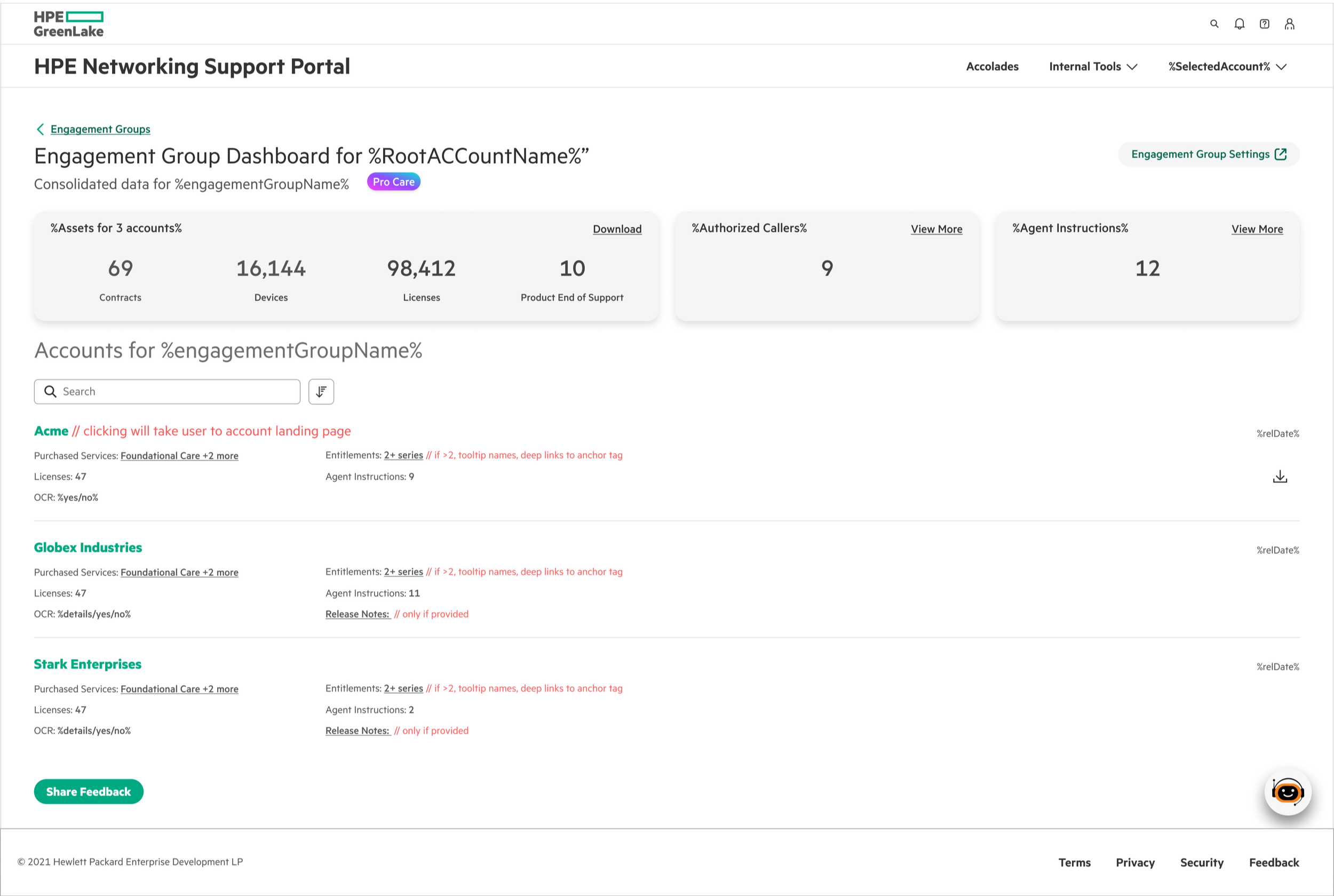
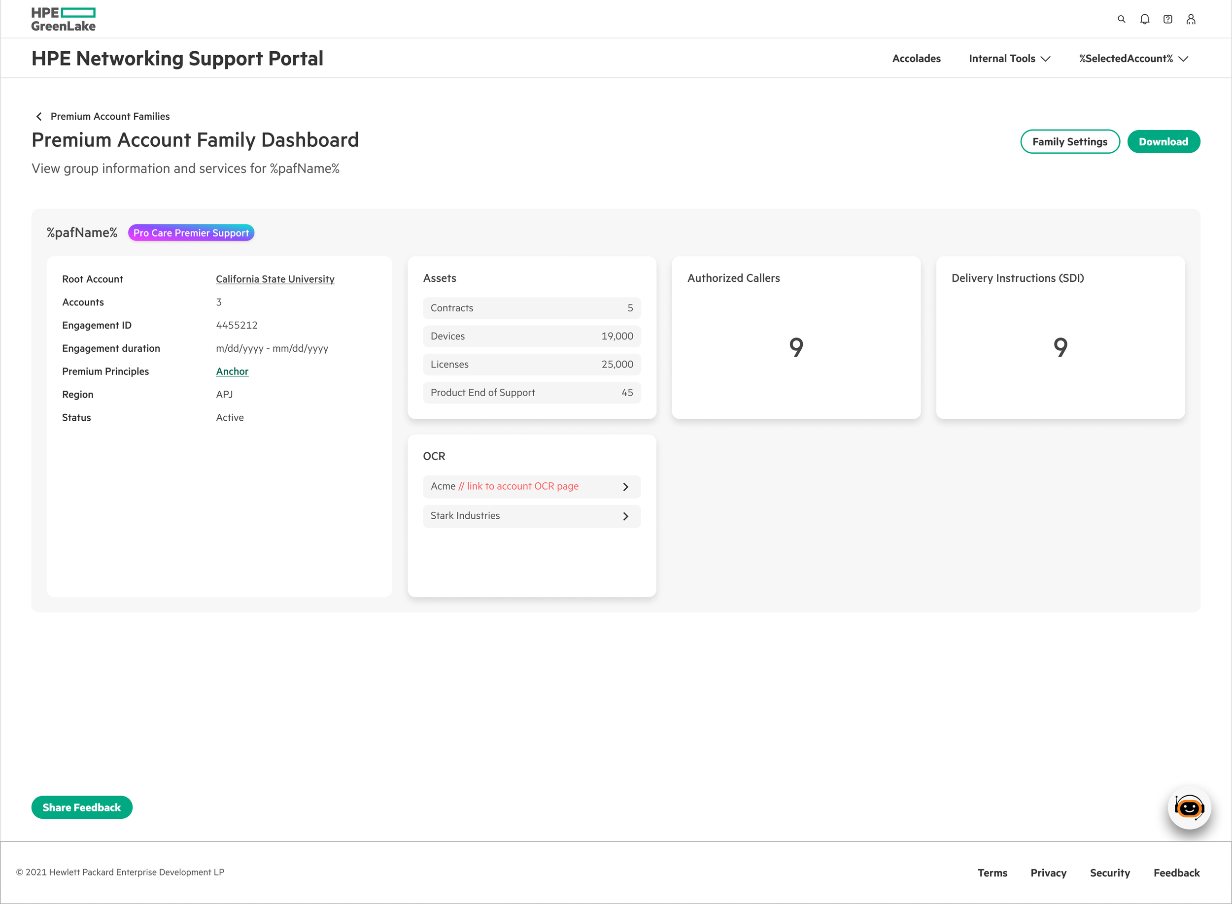
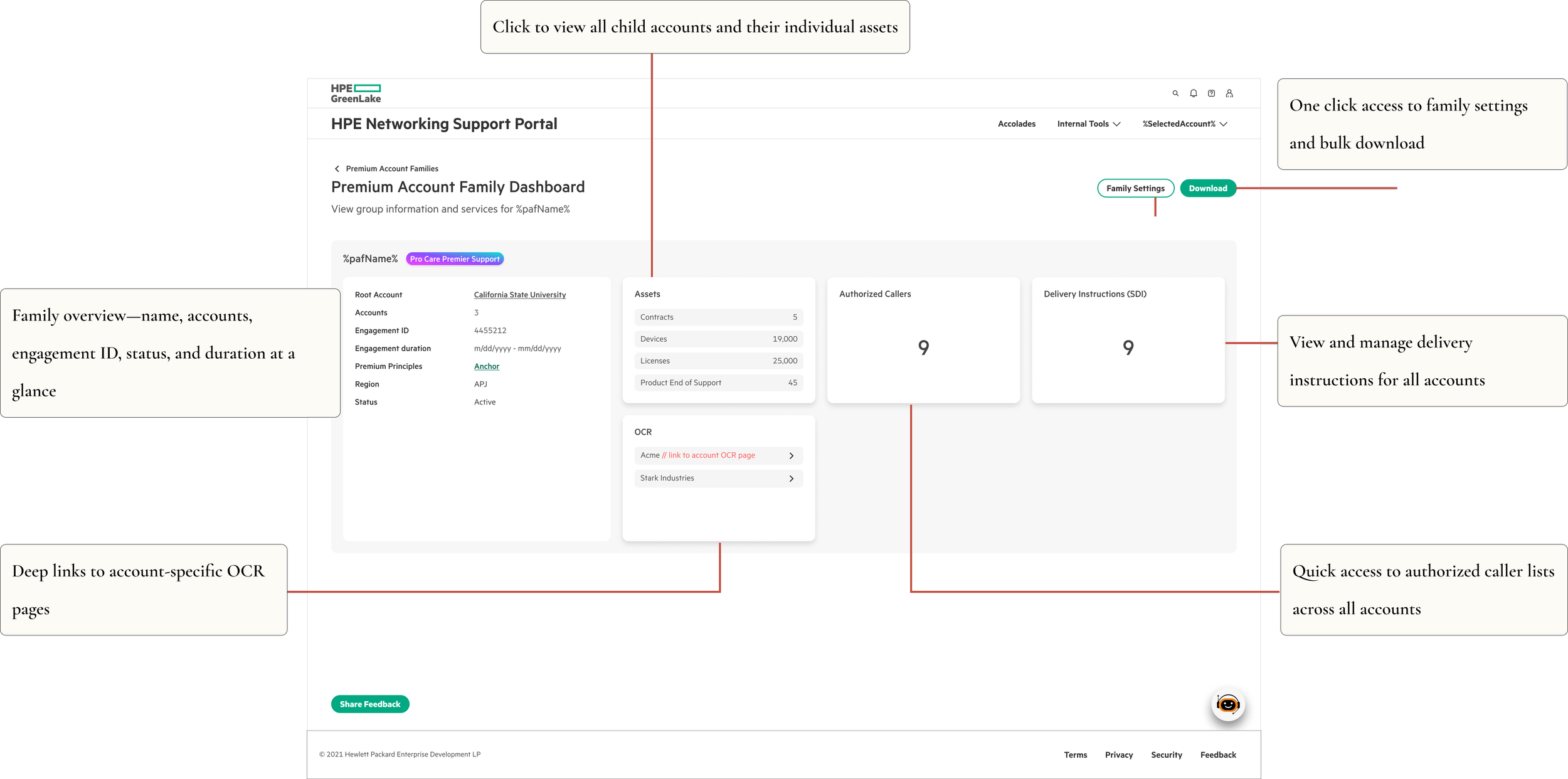
Unified Family Dashboard
One screen replaces dozens of disconnected pages. CSMs see all related accounts, their statuses, asset counts, and engagement details in a single view. No more tab-juggling. ~75% reduction in navigation clicks.
Smart Root Account Selection
From there, two paths:
Families do not exist → Create a family.
With 10,000+ root accounts in the system, showing everything at once would crash it. CSMs select one root account at a time — keeping focus on one customer while keeping the interface fast.
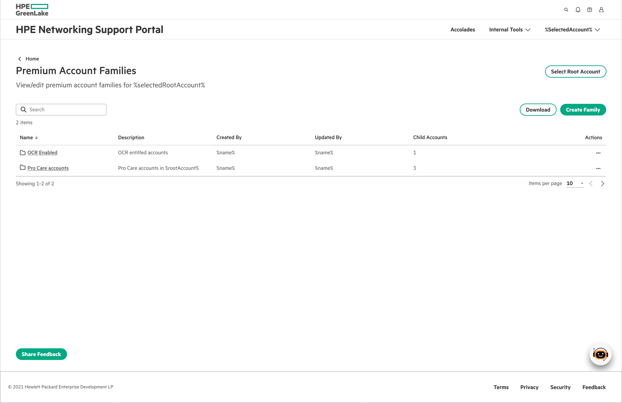
2. Families exist → Manage family.
Streamlined Family Creation
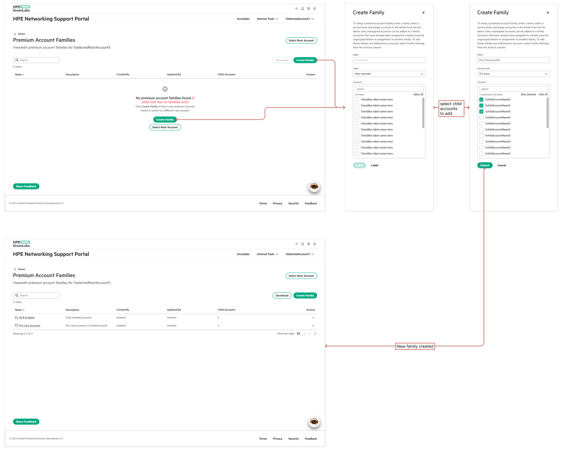
Family creation flow: From empty state to first family in 3 simple steps
Three steps: name the family and select service level, multi-select child accounts, add optional details. System auto-generates the Engagement ID. No overwhelming forms — just what's needed to get started.
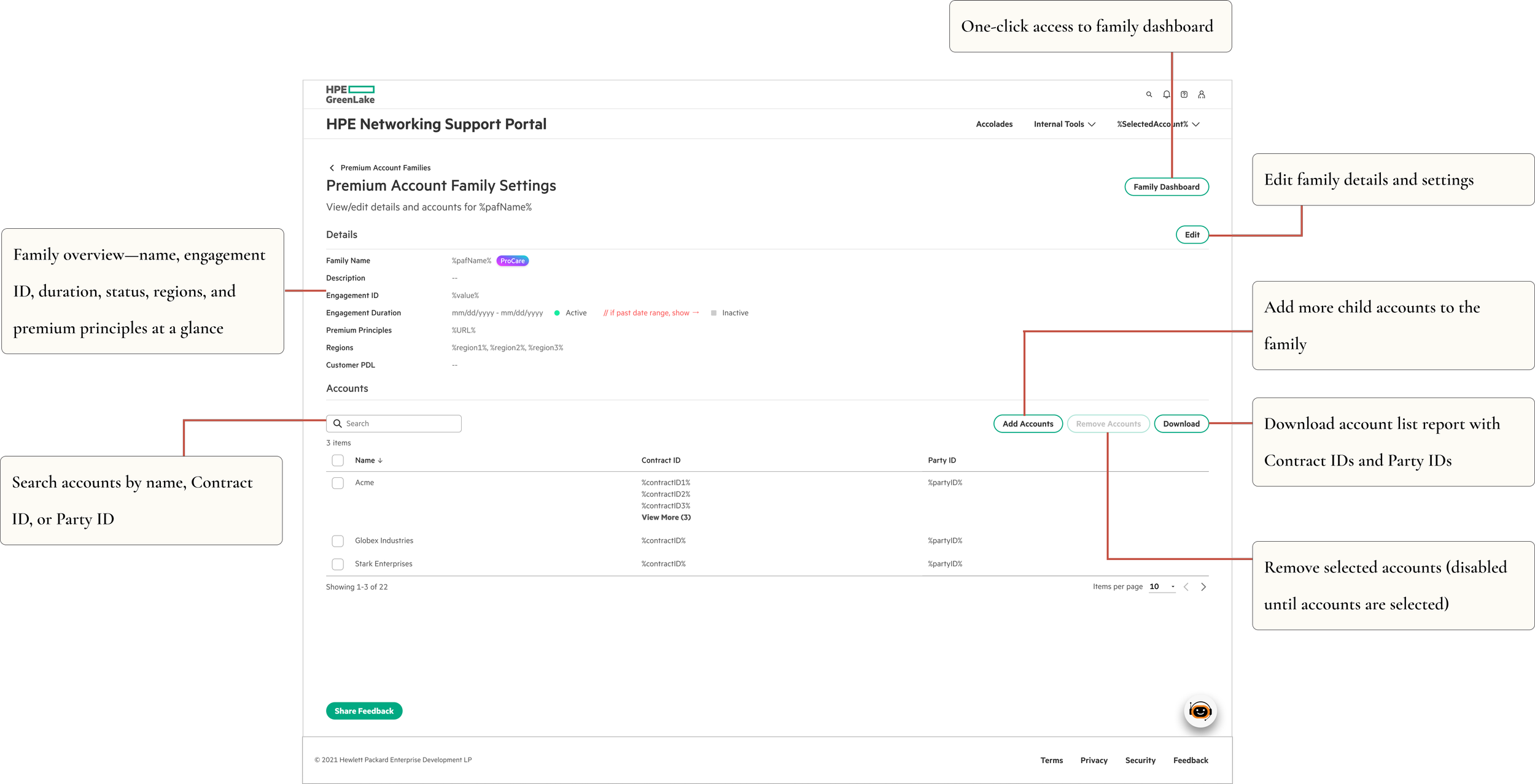
Family Settings
Detailed management for editing configurations, updating account relationships, and managing engagement parameters — all in one place.
Validation
I ran UAT with CSMs before launch — not just to catch bugs, but to validate whether information-dense was actually the right direction. It was. CSMs consistently preferred seeing more upfront over clicking through multiple screens daily.
Testing also surfaced real usability issues in the multi-select flows that we fixed before launch, and led to improved error messaging throughout.
One tester's response said it better than any metric: "This is exactly what I've been asking for. I can finally see everything I need without hunting for it."
Impact
75% reduction in clicks to access related accounts Eliminated context switching across 15+ screens for multi-account customers Strong adoption across CSM teams post-launch MVP shipped in 3 weeks with full engineering specs and UAT-validated designs
Reflections
Pushing back on best practices felt risky. Dense interfaces aren't what you typically see in portfolio case studies — or in UX guidelines. But I'd spent enough time with CSMs to know that what they needed was efficiency, not simplicity. For experienced users dealing with genuinely complex work, a comprehensive view creates less friction than a simplified one.
What I'd do differently: establish baseline click metrics before design, not after. And run a diary study to quantify context-switching costs upfront — that data would have made the case for the dense approach much faster with stakeholders.
The best interface for power users isn't the cleanest one. It's the one that gets out of their way.