
2025
HPE: Designing an Information-Dense Enterprise Experience for Power Users
Designing a comprehensive enterprise tool that breaks UX conventions to serve power users—reducing navigation by 75%.
Role
Senior Product Designer
Duration
3 weeks
Scope of Work
End-to-end UX: problem framing → strategy → interaction design → handoff
Tools

🧩 The Feature
Premium Account Family is an internal enterprise tool used by Customer Success Managers and NSP (Network Support Portal) Superusers to manage large B2B customers with multiple premium contracts.
The feature allows CSMs to group related premium accounts under a single engagement family, providing a unified, navigable view of accounts that previously existed in isolation.
🎯 The Problem
Enterprise customers often have 10–20+ premium accounts—but CSMs had no way to view or manage them as a unified group.
What was happening
CSMs were forced to:
Navigate across multiple disconnected account pages
Manually track relationships in spreadsheets
Lose context every time they switched accounts
For instance, managing a customer with 15 accounts across 3 regions meant opening 15+ different screens just to get a complete picture—then doing it all over again the next day.
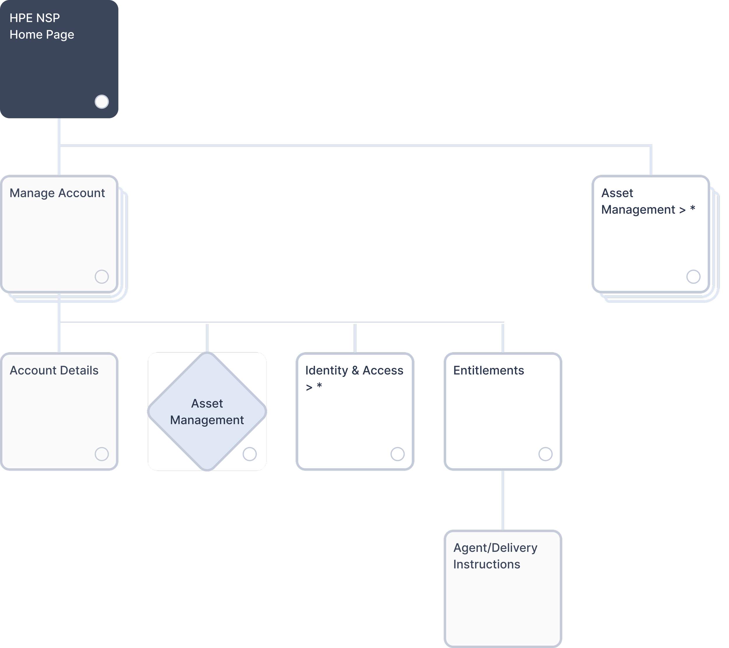
Original system architecture. CSMs navigated individual Account Details with no unified account management layer.
The system gap: The architecture had no unified layer for managing related accounts. CSMs had to navigate through individual Account Details pages to access each account separately.
This fragmentation slowed CSMs down, increased mental overhead, and made it harder to stay on top of large accounts.
Result: High effort, low visibility, and error-prone workflows.
Key Pain Points
❌ No unified view of related accounts under one organization
❌ Excessive clicking across disconnected screens
❌ Manual relationship tracking outside the system
❌ Context loss during navigation
👥 The Users
Customer Success Managers & NSP Superusers
These are highly technical, experienced professionals managing enterprise relationships with 5–20+ premium accounts per customer.
Key Insight
These CSMs don't need simplified interfaces—they're managing accounts worth millions and need comprehensive data at their fingertips.
What looks "clean and minimal" to them is actually slower. They wanted everything visible so they could work fast.
🗺️ Understanding the System
Premium Account Families didn't exist before—I was adding a new organizational layer to the HPE NSP architecture.
The challenge: determining how it would connect to existing features like Account Details, Asset Management, and Entitlements while providing clear entry points and navigation.
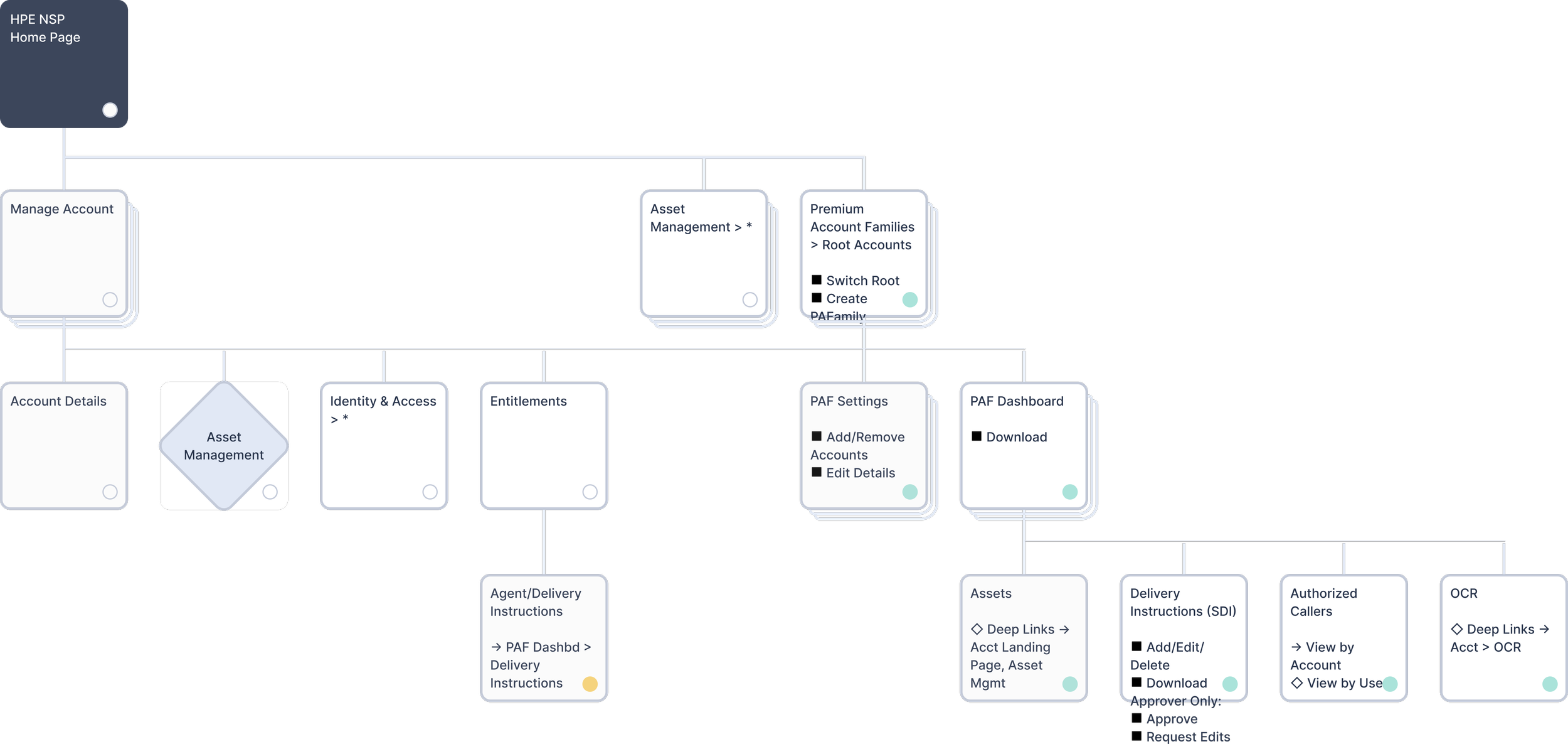
Updated architecture with Premium Account Families providing unified account management.
⚖️ The Design Challenge
The Core Tension
Most UX patterns push for simpler interfaces that reveal information gradually, keeping screens clean and cognitive load low.
But CSMs needed to see account hierarchies, relationships, statuses, and metadata all at once to make informed decisions quickly.
Finding the Right Balance
I explored three versions to find the sweet spot between simplicity and comprehensiveness.
Version 1: Too Simple
Version 2: Too Dense
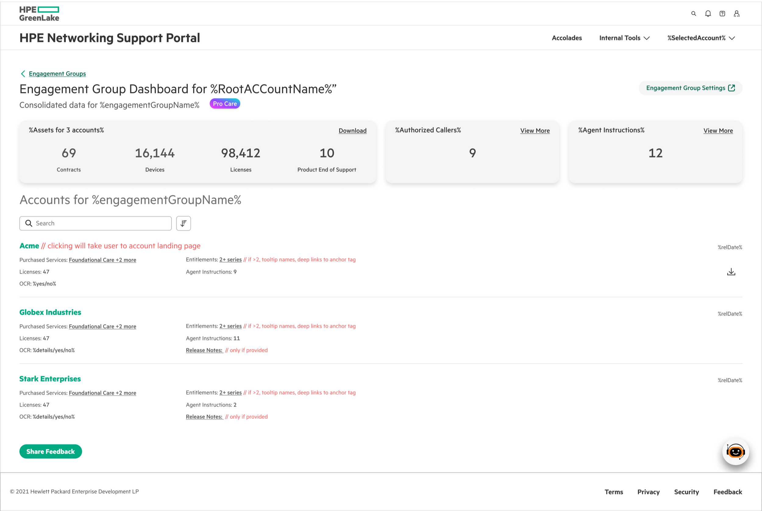
Clean card-based hub following standard dashboard patterns. CSMs had to click into each card to see basic information like asset counts or caller lists.
Problem: Added unnecessary clicks. Quick checks became multi-step workflows.
Went the opposite direction—everything visible at once. Maximal information density.
Problem: Information overload. Too cluttered and overwhelming, even for technical users. Hard to scan and find what you need quickly.
The Final Approach
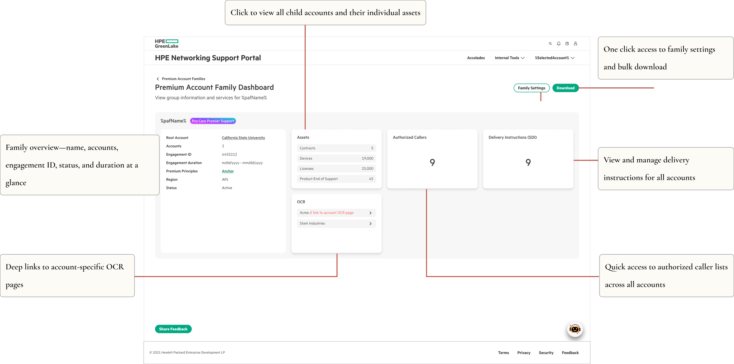
I landed on a balanced solution—comprehensive but organized. The interface provides what users need upfront while maintaining visual clarity.
This proved that the "right" density isn't about following conventions—it's about matching the interface to how users actually work.
🎨 The Solution
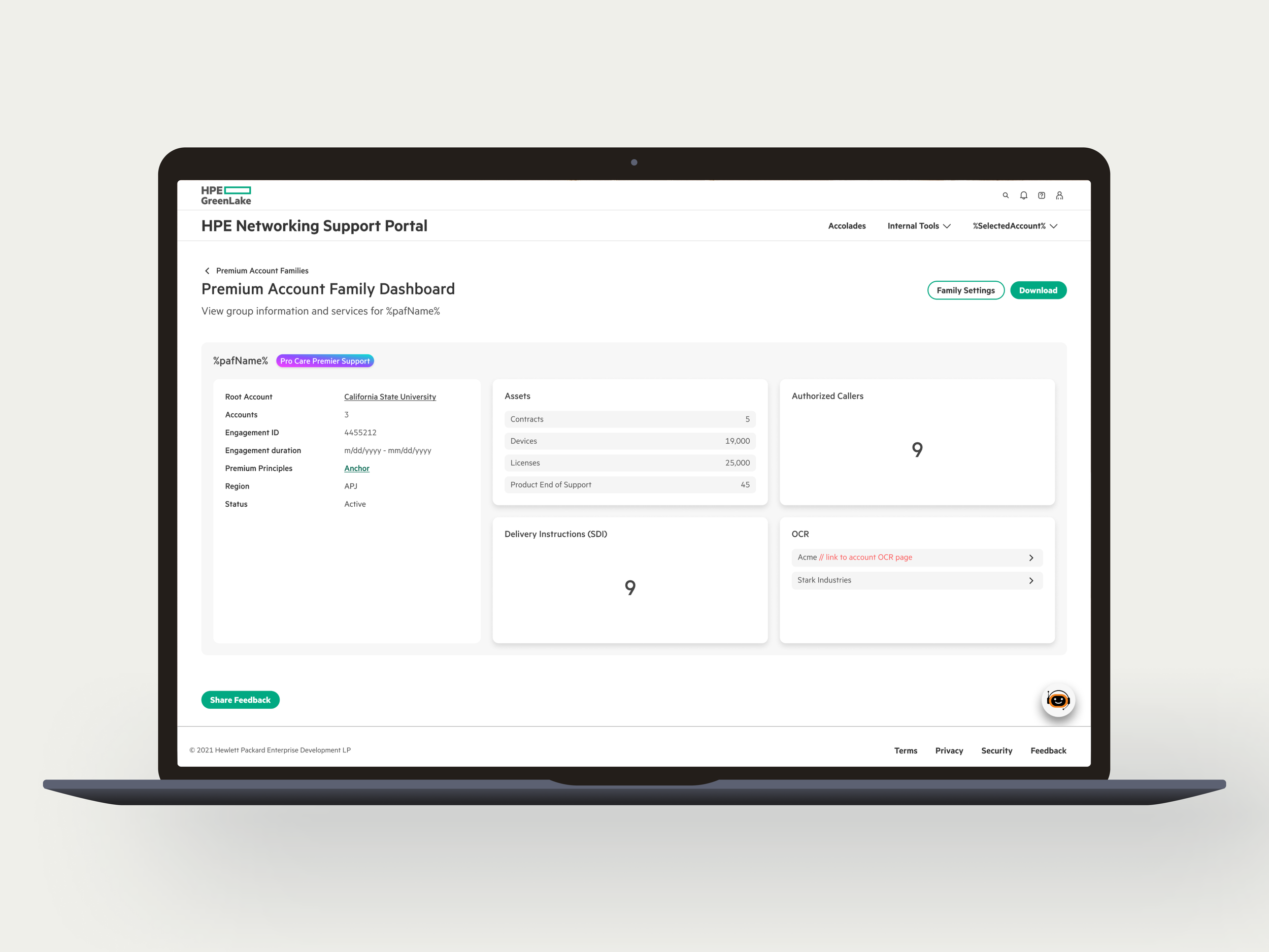
🧭 Unified Family Dashboard
One screen replaces dozens of disconnected pages.
Result: ~75% reduction in navigation clicks
🔀 Root Account Selection
Starting point: CSMs access Premium Account Families from the Internal Tools menu and land on this page.
The decision: CSMs select one root account at a time before viewing families.
Why it works:
With 10,000+ root accounts, showing everything at once would crash the system and overwhelm users. Single-root selection keeps CSMs focused on one customer at a time while keeping the interface fast.
From here, two scenarios unfold:
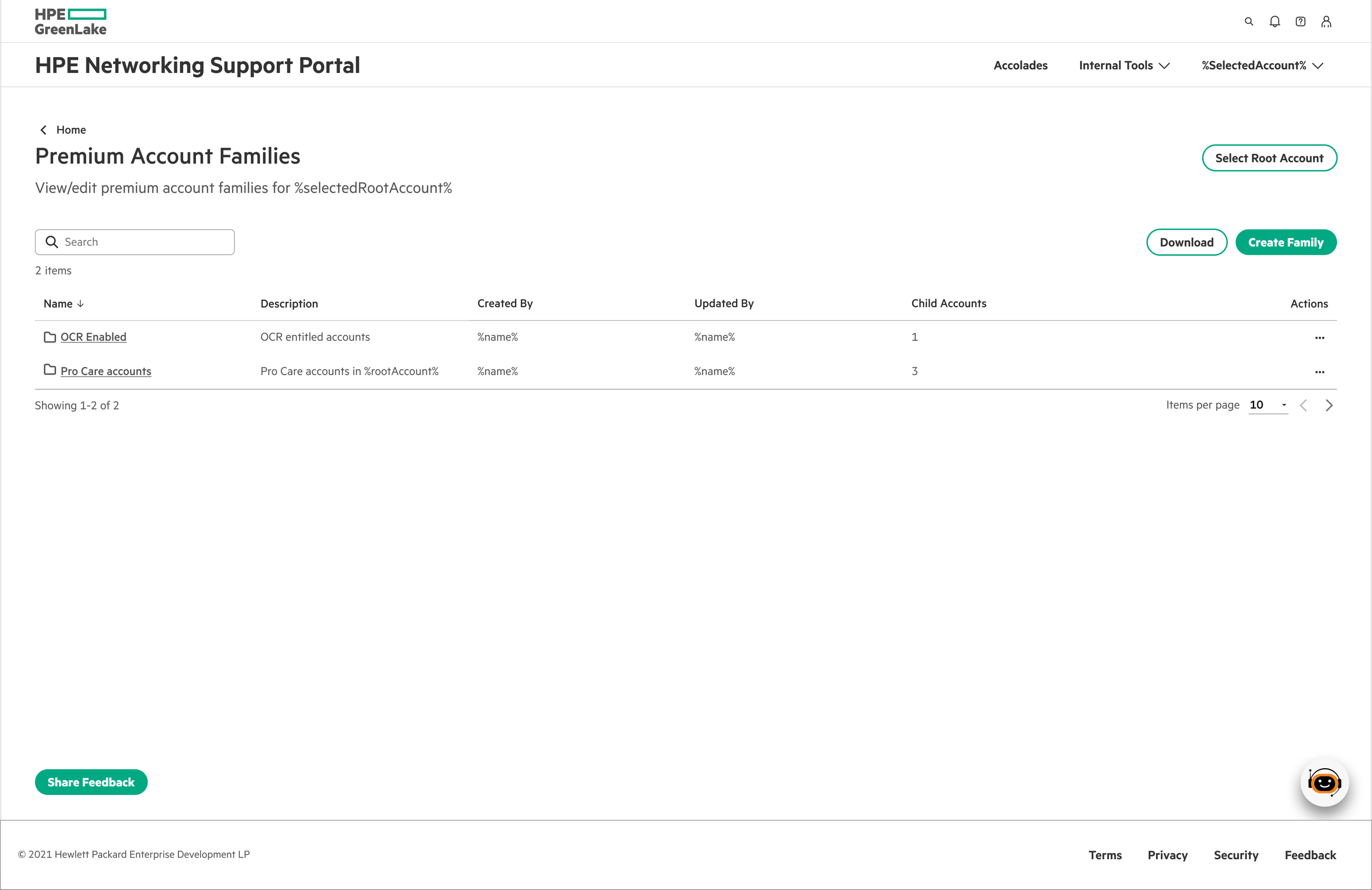
Scenario 1:
No families yet - Click "Create Family" to start the flow
Scenario 2:
Families exist - View existing families or create additional ones for that root account
🎯 Simple Family Creation
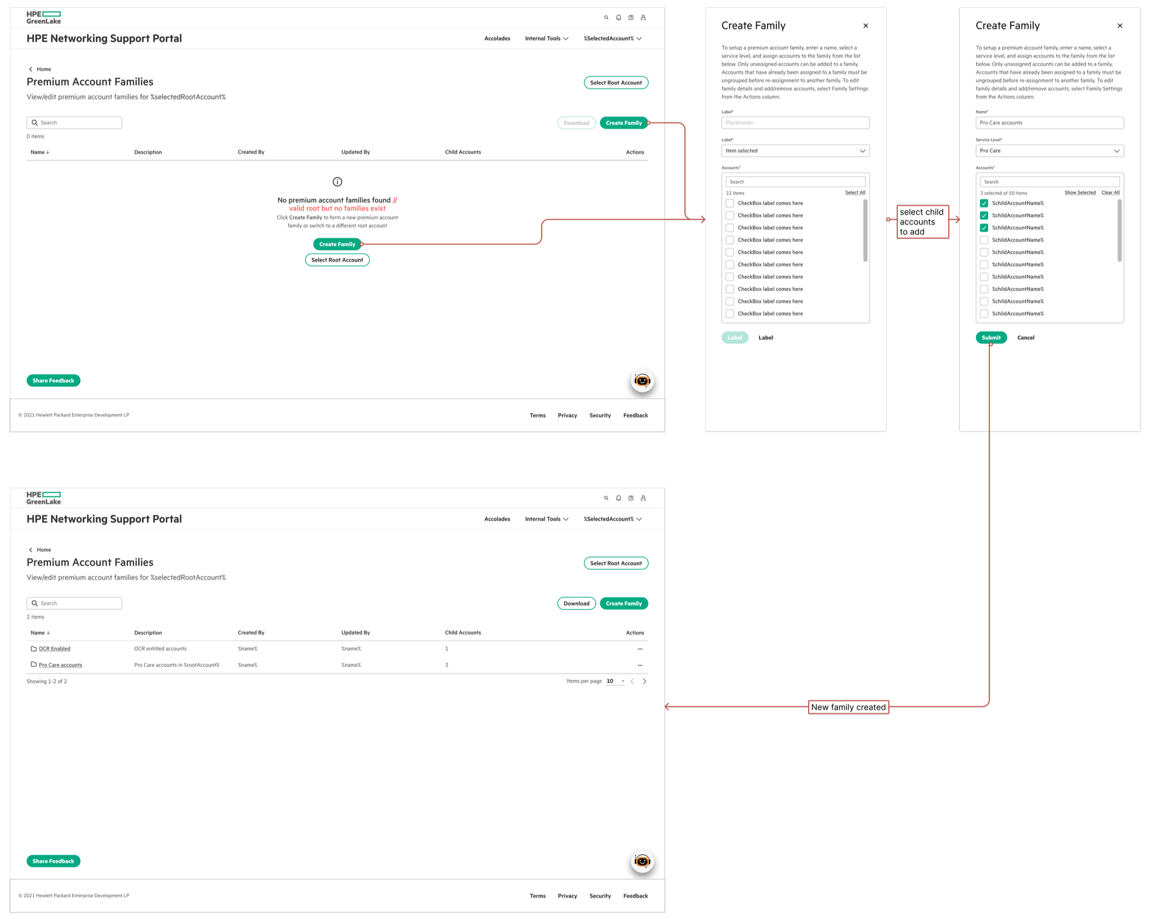
Family creation flow: From empty state to first family in 3 simple steps
Stripped down to essentials—CSMs can create a family in three quick steps:
Name the family and select service level
Multi-select child accounts to include
Add optional details (region, engagement duration, customer info)
System auto-generates the Engagement ID. No overwhelming forms—just what's needed to get started.
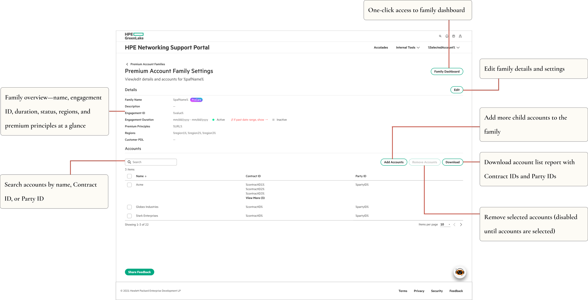
⚙️ Family Settings
Detailed management interface for editing family configurations and account relationships.
🧪 Validation
I conducted UAT testing with CSMs before launch to validate the design approach.
Key findings:
Identified and fixed usability bugs
Validated the flows
Improved error messaging and validation feedback
Testing confirmed what I suspected: CSMs appreciated the comprehensive view. They'd rather learn a richer interface once than click through multiple screens daily.
📊 Impact
Efficiency Gains:
75% reduction in clicks to access related accounts
Enhanced visibility across account families
Strong adoption across CSM teams
Live feature successfully launched
Enabled CSMs to manage large enterprise customers with significantly less context switching.
Delivered:
MVP in 3 weeks with full engineering specs
UAT-validated design with user-driven improvements
Scalable foundation for future service level expansion
💭 Reflections
Know your users well enough to break the rules
Honestly, pushing back on "best practices" felt risky at first. Dense interfaces aren't what you typically see in portfolio case studies. But I'd spent enough time understanding CSMs to know that what they needed was efficiency, not simplicity—and sometimes those are different things.
What worked:
Trusting users' technical capabilities instead of assuming limitations
Consolidating information to eliminate jumping between screens
Building smart validation directly into the UI
What I'd do differently:
Establish baseline metrics earlier for better comparison
Explore more micro-interactions for smoother account management flows
Document UAT findings more thoroughly for future iterations
Key Takeaway: Match your interface to the actual complexity of the work. For experienced users dealing with inherently complex systems, comprehensive views often create less friction than oversimplified ones.