
Crate Away started as a question: why is monitoring your dog's health still so manual? The answer became a two-part product — an ecommerce site selling smart crates and hardware, and a companion app that turns daily observations into a running health record your vet can actually use.
2021
Role: Product Designer, UX Research, UX/UI
Tools: Figma, Userlytics, Jira
View Live Site →
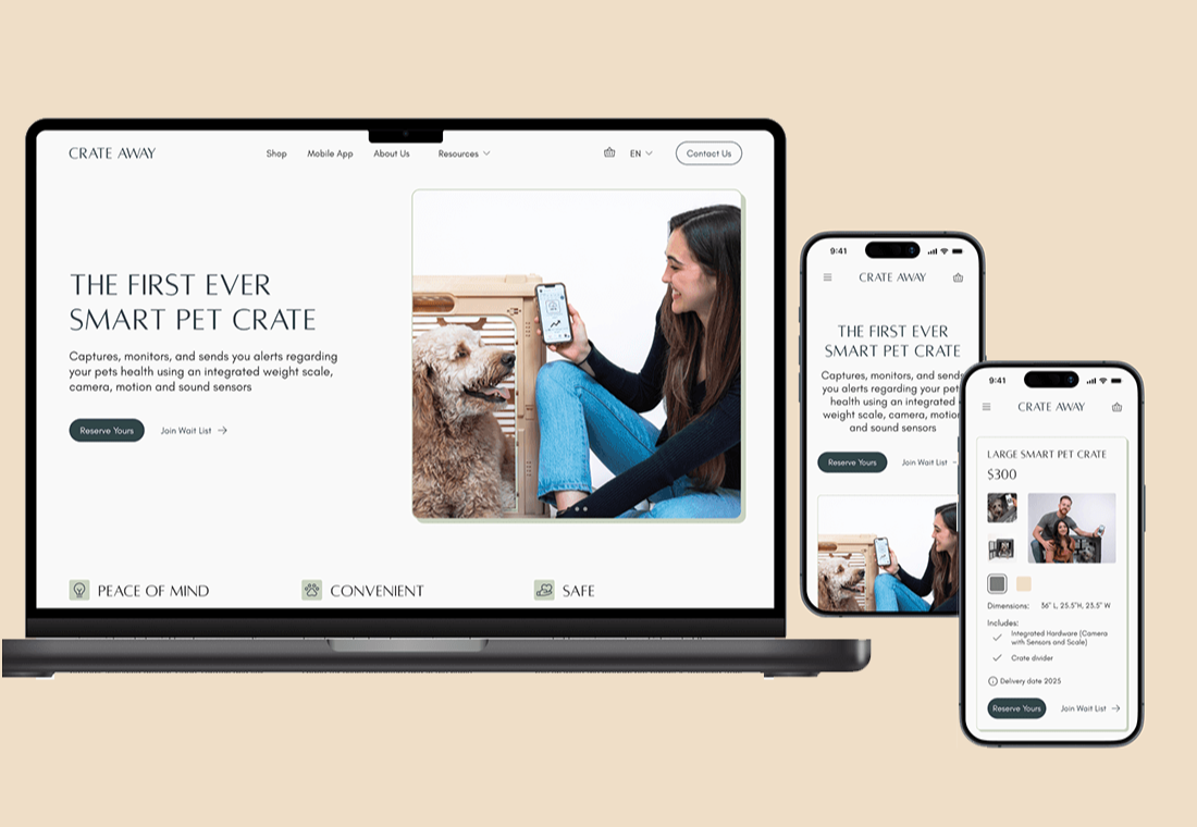
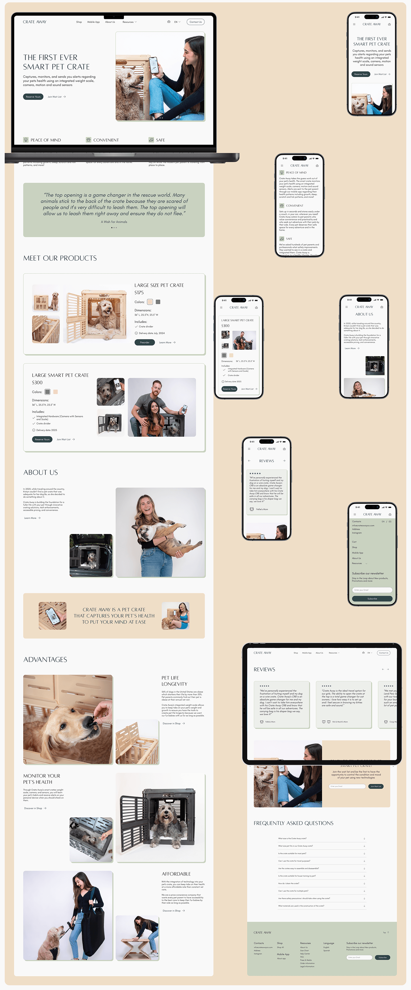
Crate Away: Launching an Ecommerce Experience for a Smart Pet Product
Challenge
Pet owners face a straightforward problem: traditional crates don't connect to anything. No health monitoring, no remote access, no visibility into what's happening when you're not home. Crate Away was building a solution — but the smart crate wasn't ready at launch.
The design challenge was twofold: create an ecommerce experience that converts for the standard crate now, while building enough anticipation for the smart crate that owners would join a waitlist and wait.
The Approach
I mapped user flows and information architecture before touching visual design — the product hierarchy needed to be clear before anything else. Two products, different purchase paths, one coherent brand experience.
The design system was built around the brand's positioning: eco-friendly, calm, approachable. Clean layouts, natural tones, minimal friction between landing and purchase.
Key decisions: color and size options surfaced early in the product page to reduce decision paralysis, a waitlist signup prominent on the smart crate page to capture intent without pushing a product that wasn't ready, and a competitor analysis that shaped how we positioned the smart crate's technology against what was already on the market.
Competitor Analysis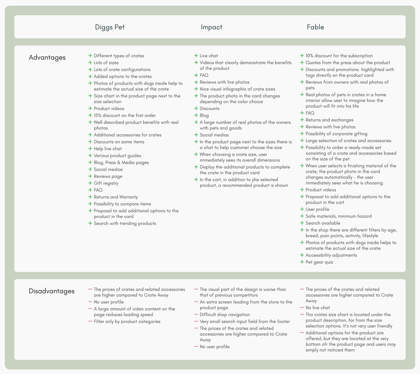
System Architecture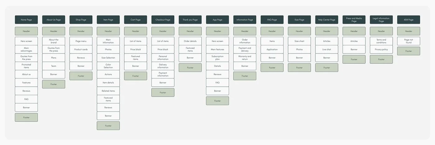
What I Delivered
Website, tablet and mobile app designs across the full purchase flow — product discovery, product detail, pre-order, and waitlist signup. Lo-fi wireframes handed off to developers with guidance for high-fidelity build. Branding and design system established for consistency across surfaces.
The App
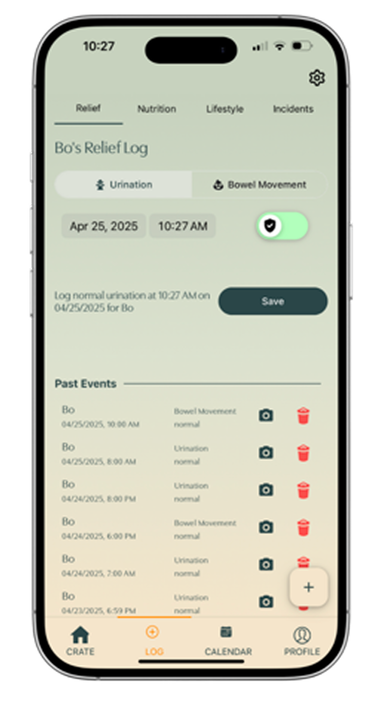
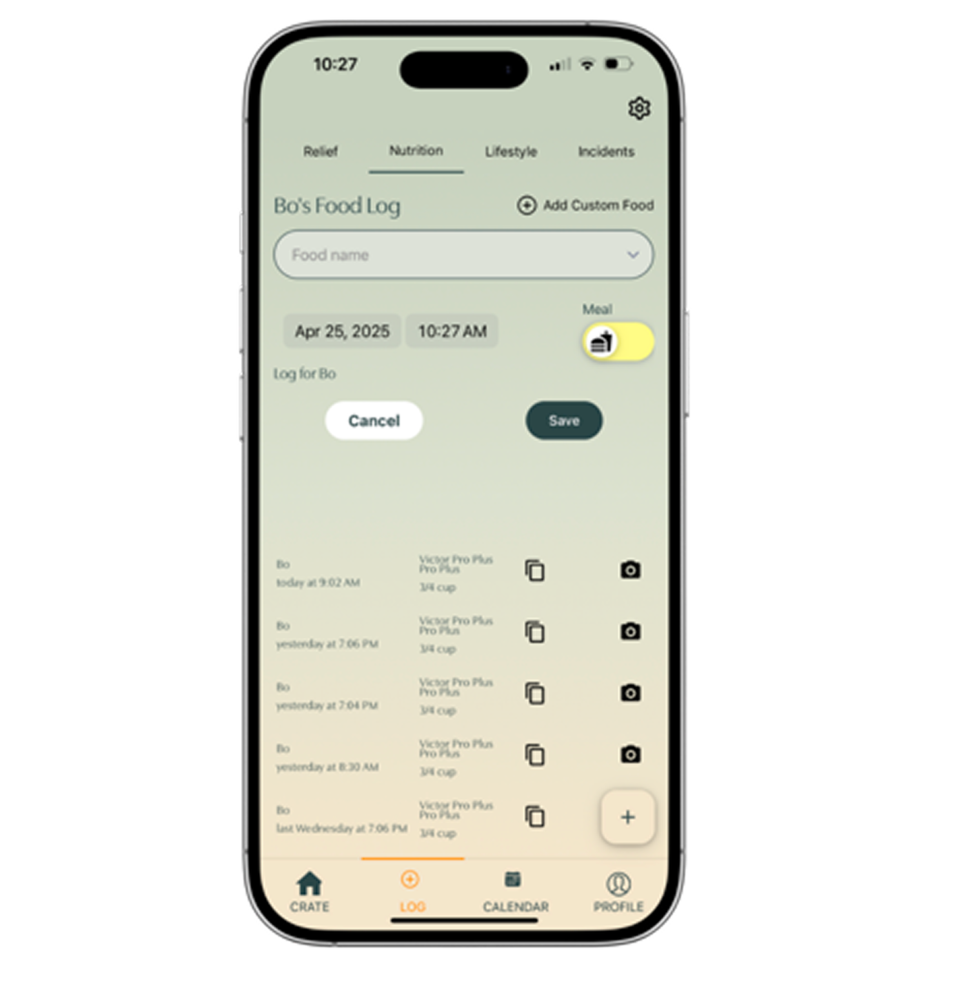
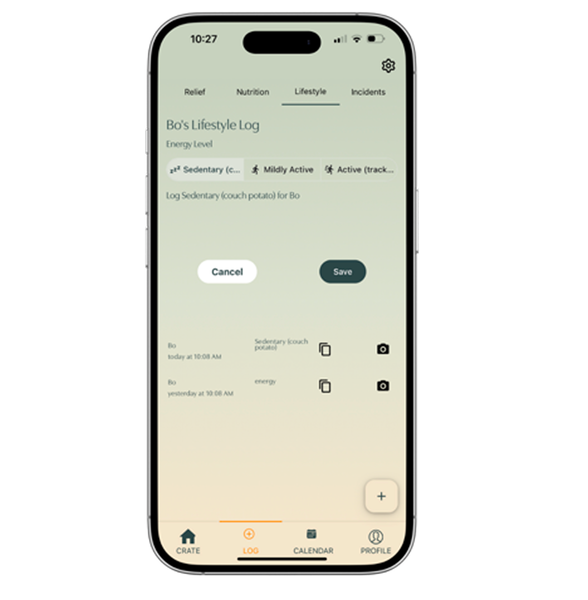
The Crate Away app gives each dog a profile that travels with them through life — bathroom habits, food intake, activity patterns, incidents, medications, and more, logged in one place and ready to share at any appointment.
The design brief was simple: make it easy enough that owners actually use it. Logging a bathroom trip or a vomiting incident takes seconds. The calendar view pulls everything into a single screen so patterns become visible without any interpretation required.
The real value is what accumulates over time. A vet seeing three years of nutrition logs and incident reports arrives at a diagnosis differently than one working from memory and a worried owner's account. Crate Away built the infrastructure for that conversation.
The app launched with a beta community and a subscription model — recurring revenue alongside the hardware business, and a reason for customers to stay engaged long after the crate ships.
Reflections
Designing for a pre-launch product taught me something about the relationship between design and trust. When users can't buy the thing they actually want yet, the design has to do the work of making waiting feel worthwhile. The waitlist wasn't just a form — it was the product experience for the smart crate at that stage.
Two products, one thesis: the best thing you can do for your dog's health is write it down.