
2023
Fluidra: A Field Service App Built Around How Technicians Actually Work
Technicians had 40–60 minutes per appointment and an app that buried everything they needed. I redesigned the information architecture around the field — not the system.
Role: Product Designer, UX Research, System Designer
Duration: 6 weeks
Tools: Figma, Jira, Userlytics, Adobe Ilustrator View Live App →
The Users
Pool technicians range from young tech-native workers to experienced tradespeople in their 50s. They work outdoors — in sunlight, rain, sometimes snow — often with wet hands and a narrow time window. This wasn't a user group I could design for from a desk.
The Problem
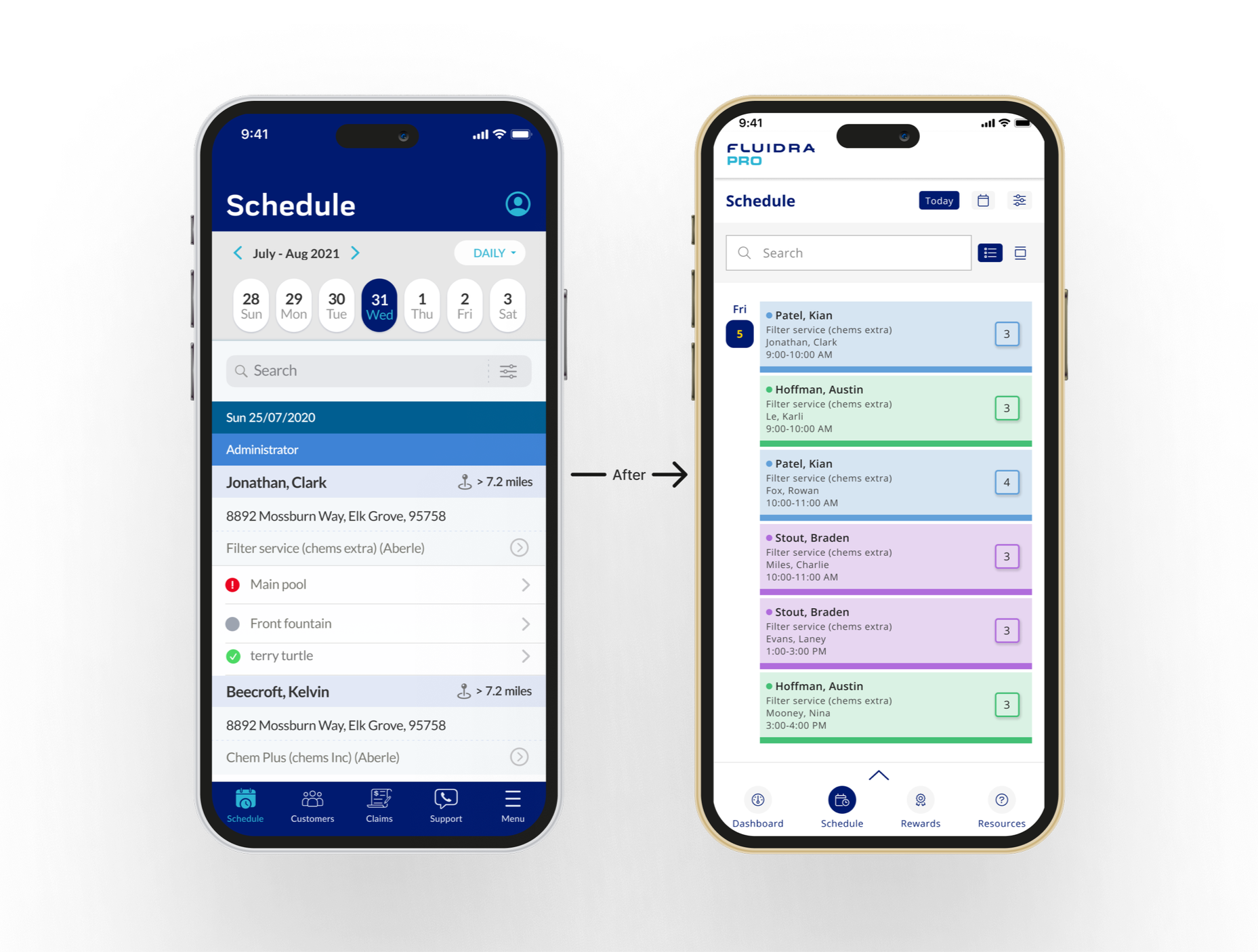
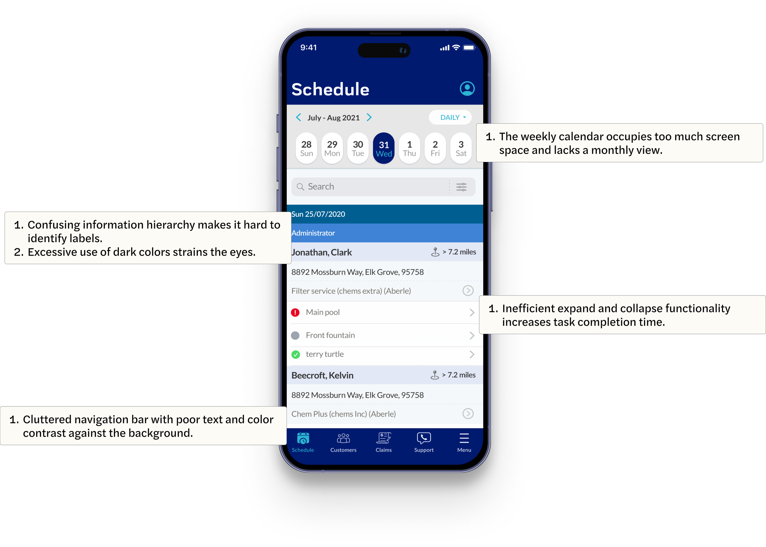
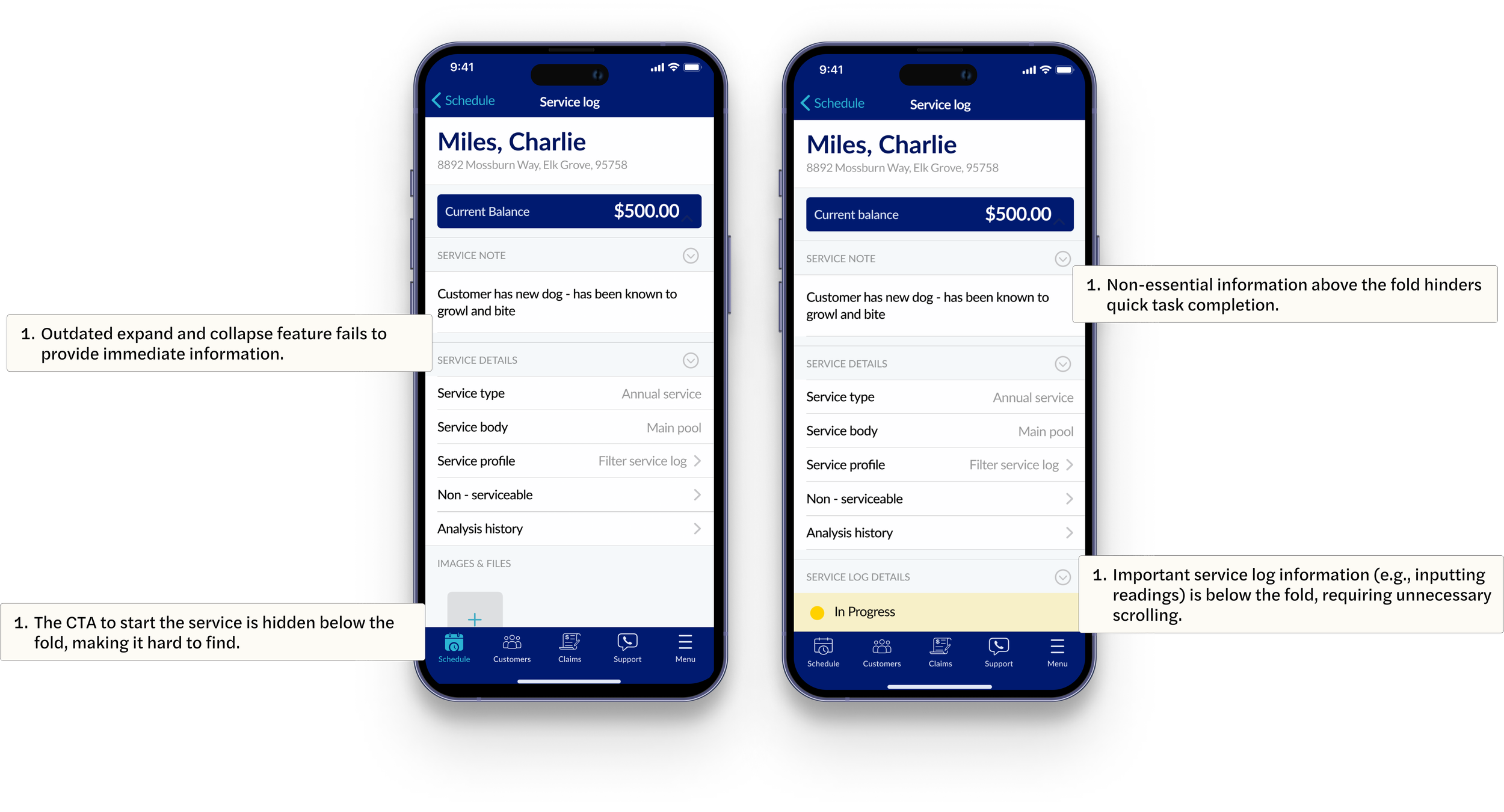
The Fluidra Pro app was organized around the system's data structure, not how technicians actually work. The schedule was cluttered, critical information was buried behind expand/collapse interactions, and getting from schedule to service log took too many taps. Every extra click was time a technician didn't have.
Exploring the Pre-Exisiting App
By using user feedback, data analytics, and analyzing the existing app, the goal was to find areas of friction and opportunities for improvement.
This process is essential for improving the app's functionality, building user loyalty, and meeting business goals.
On-Site Testing & Validation
We went to actual pool sites and tested with technicians in the conditions they work in every day — including direct sunlight. That decision changed the design in ways lab testing never would have. Contrast that looked fine on a monitor became unreadable outdoors. We iterated on contrast, type weight, and button sizing based on what we saw in the field.
To validate the redesign more broadly, I ran unmoderated testing through Userlytics with 12 users — comparing prototypes of the existing app and the redesigned screens across task completion time, error rate, satisfaction, and task success rate. The results shifted several interaction patterns that had looked right in Figma but created friction in real use.
The Redesign
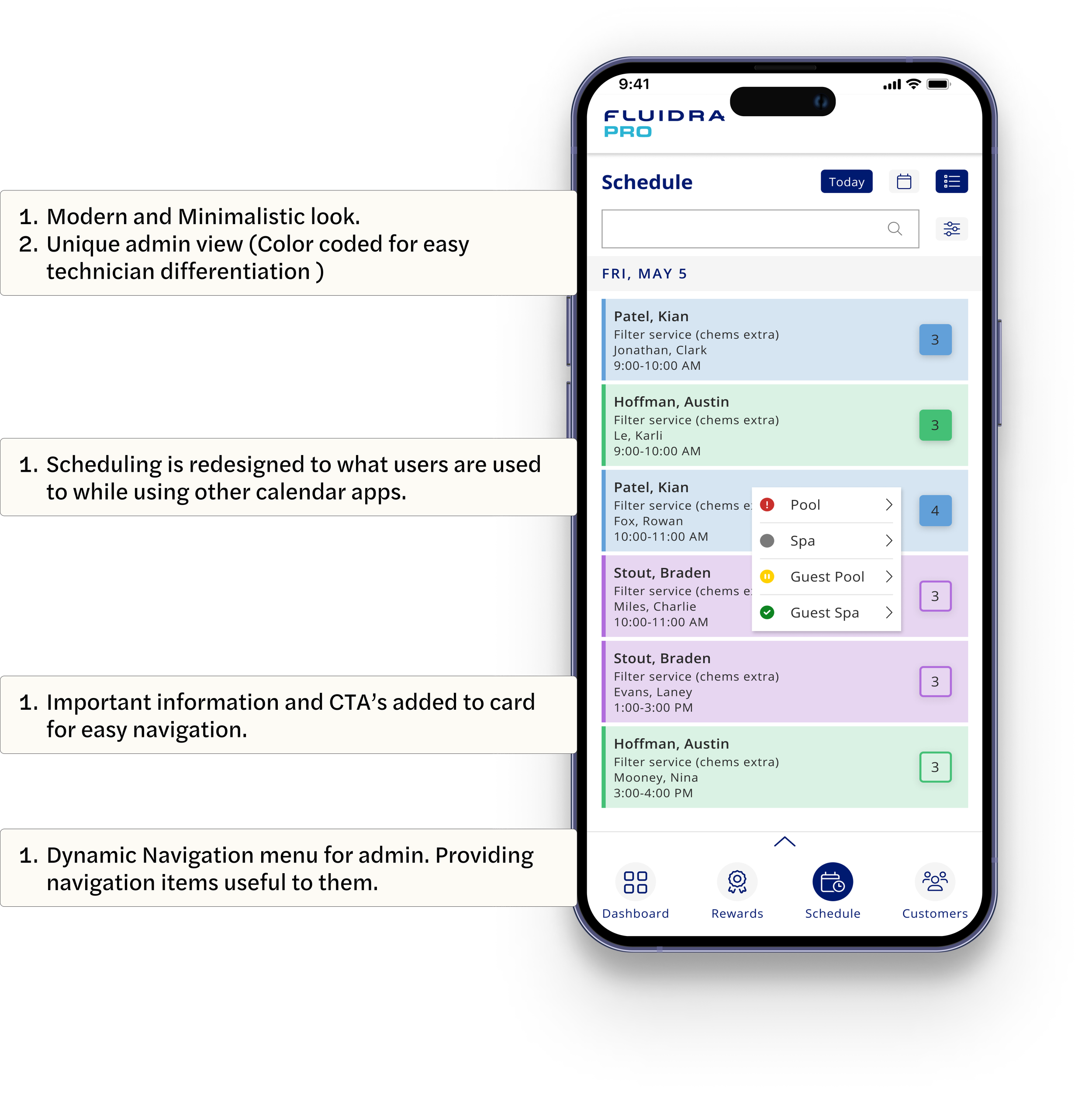
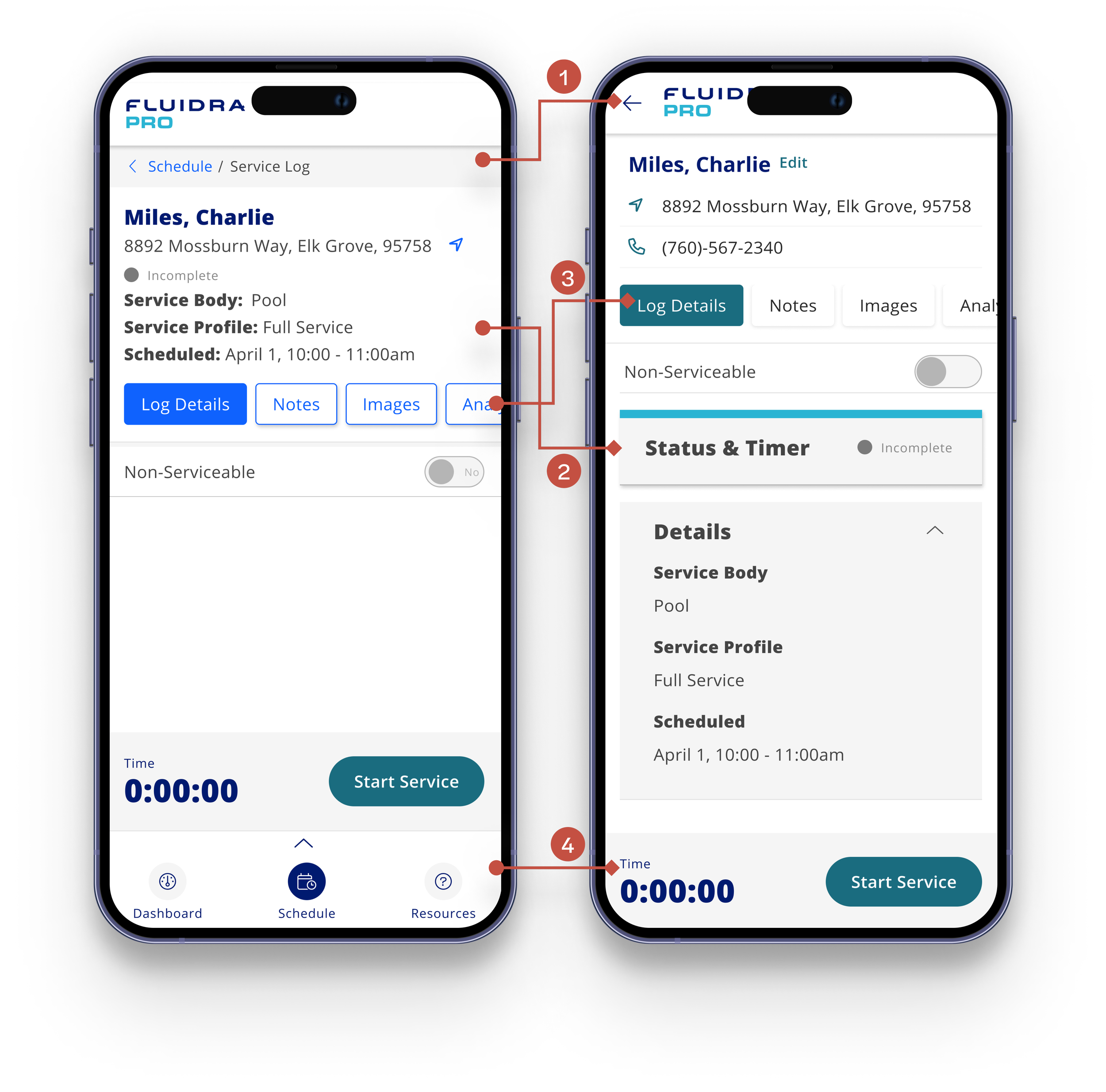
I started with the schedule screen — the entry point of every technician's workflow — and redesigned outward. New schedule: clean, color-coded, scannable. Appointment details visible without expanding. Service log reachable in fewer taps.

Four changes came directly from testing:
1. removed breadcrumbs in favour of a simple back arrow
2. organized content into widgets for faster scanning
3. simplified tab design
4. removed bottom navigation on service screens to focus attention on "Start Service."
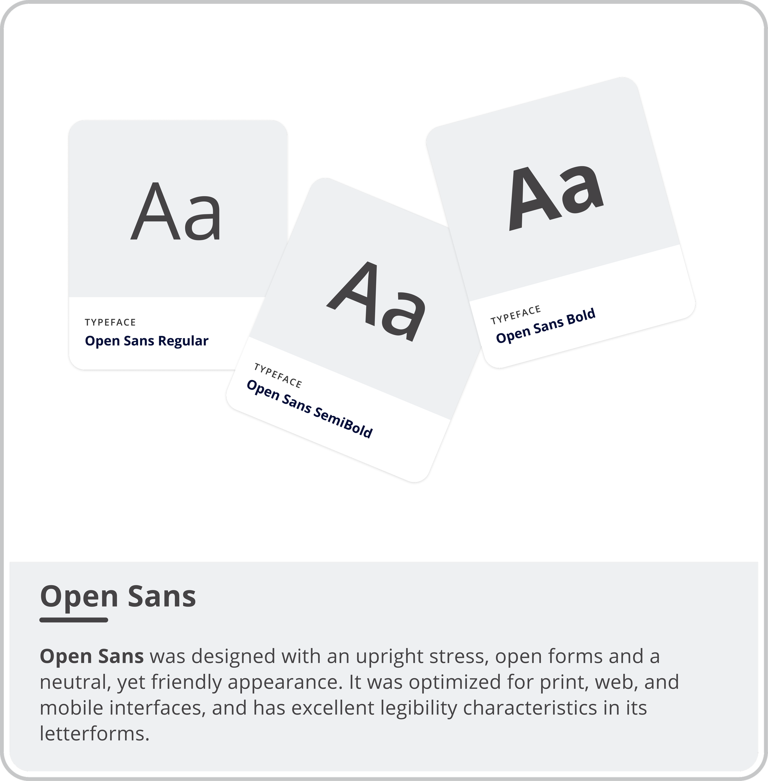
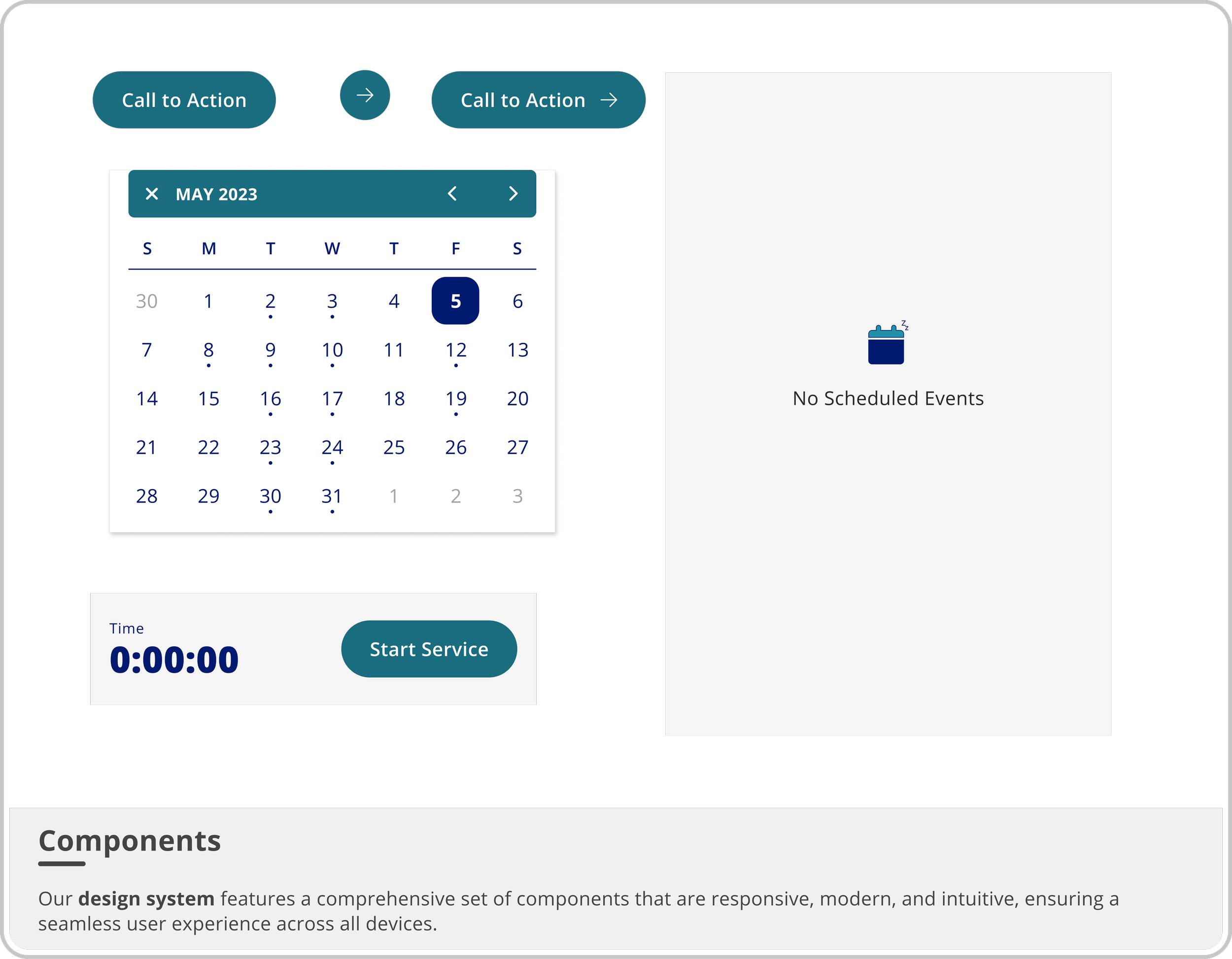
The Atlantis Design System — built on Open Sans and a blue palette optimised for outdoor visibility — kept 42 screens consistent across the redesign. View Design System in Figma →

Impact
+40% user engagement post-launch
+25% service efficiency
Live on the App Store since January 2024.
Reflections
The most valuable thing I did on this project was leave the office. On-site testing revealed contrast issues, sizing problems, and flow friction that would have shipped if we'd only tested in a lab.
Design for the conditions people actually work in — not the conditions you test in.

